Artist Tony Sjoman’s New Mural at The Centrale Evokes New York’s Cityscape
By: LX Collection
Tony Sjöman’s favorite New York City building may be the Chrysler Building, but that doesn’t mean he dislikes the glassy contemporary structures of the 21st century. In fact, it’s the opposite.
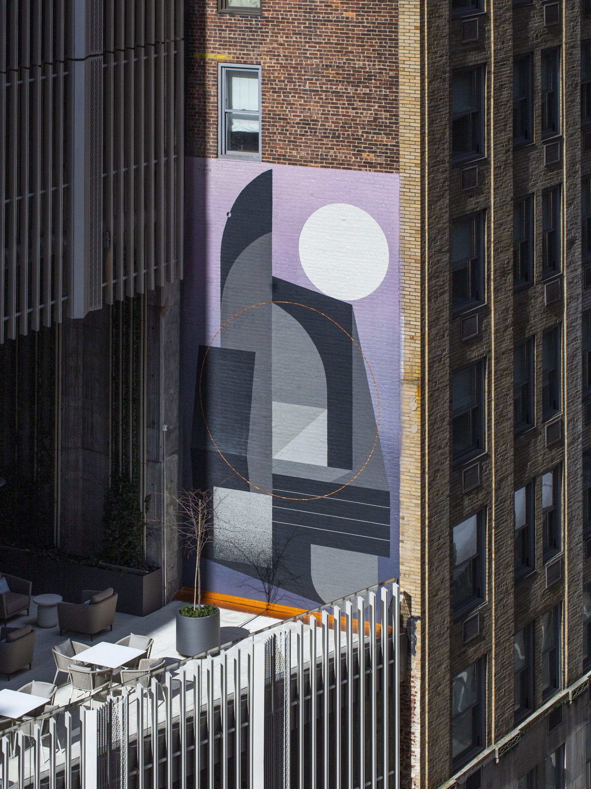 Photo Credit: Jakob Dahlin
“A lot of the New York architecture inspires me—old and new,” says the Manhattan-based Scandinavian artist. “It’s easy to like all the old stuff, but I also try to appreciate new architecture.”
A mix of the two is found on nearly every city block, but particularly in Midtown, a neighborhood where new towers regularly sprout next to century-old landmarks. The dichotomy inspired Sjöman’s most recent mural.
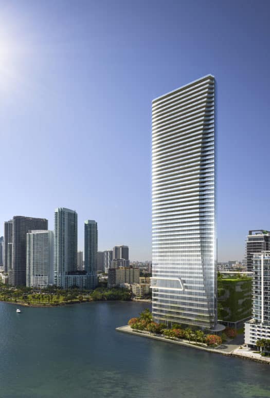
Located on the second-floor terrace of The Centrale, a 71-story condo building by Ceruzzi Properties on East 50th Street between Third and Lexington Avenues, the abstract mural, a collaboration between The Centrale and LX Collection, features geometric shapes in various shades of gray that evoke a layered cityscape, not unlike the environment in which it sits.
“When we first met Tony, he intuitively understood the juxtaposition of new and old,” says Gabrielle Healey, VP of marketing and sales at Ceruzzi. “The mural bridges the property to the surrounding neighborhood.”
On one side of the 30-foot mural, a tall, rounded column rises to the top, reminiscent of the art-deco curves of Sjöman’s favorite building’s crown. (In fact, he calls these shapes “Chryslers.”) On the other, a pale circle balances on a gently sloped rectangle, calling to mind, as Healey points out, the sun rising over the buildings of 50th Street. The muted color palette, typical of Sjöman’s work, combines “the dark Nordic landscape and the hectic cityscape,” his two biggest inspirations.
“Tony presented us with many sketches, all within a similar palette, but this one particular design resonated with the whole team, and it turned out to be his favorite as well,” says Healey. “The flow of the geometric design is eye-catching and three-dimensional in nature. The left side of the image almost resembles The Centrale itself, and I think this is something that we all recognized and valued.”
Sjöman works entirely freehand, using neither stencils nor tape to create those perfectly straight lines and proportional circles. (He credits the Finnish concept of sisu, “a combination of perseverance and patience,” with this talent.) But it was the gradient background of this design that proved to be most challenging for him.
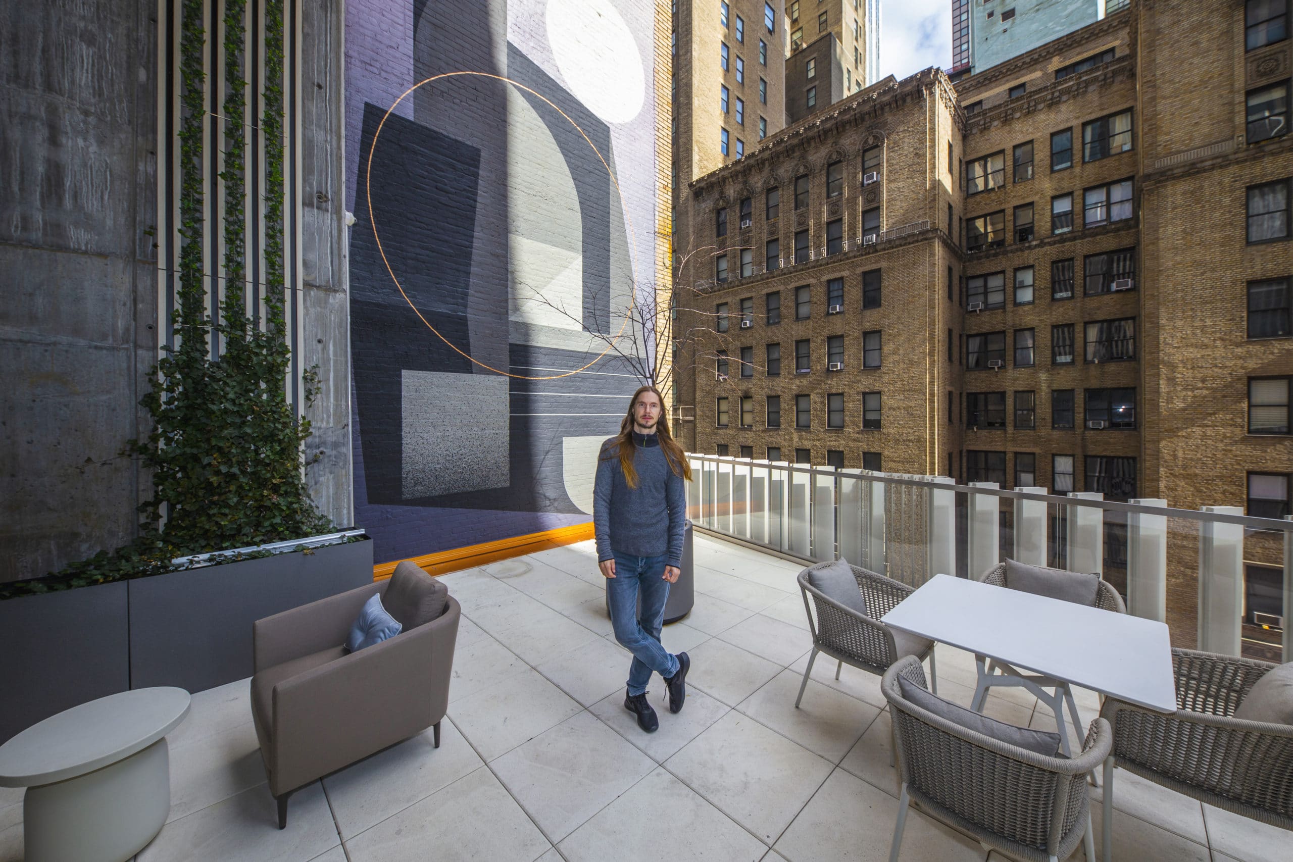 Tony Sjöman in front of the mural at the Centrale.
(Photo Credit: Jakob Dahlin)
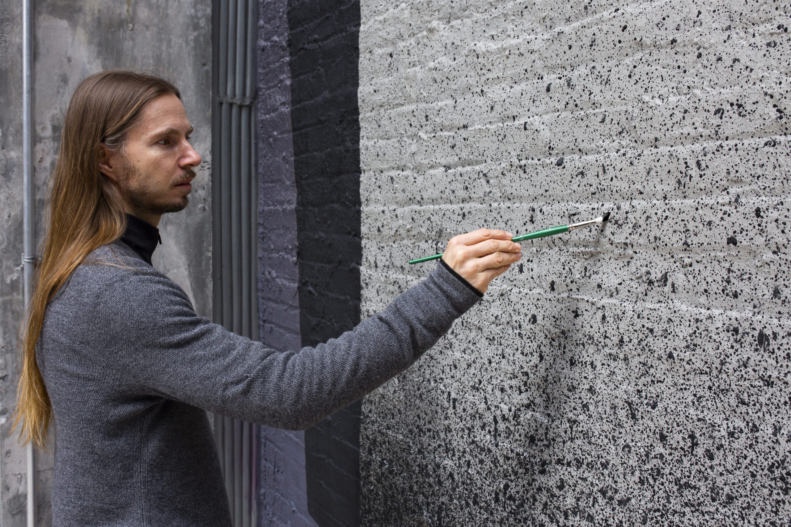 Tony Sjöman painting the mural at the Centrale.
(Photo Credit: Jakob Dahlin)
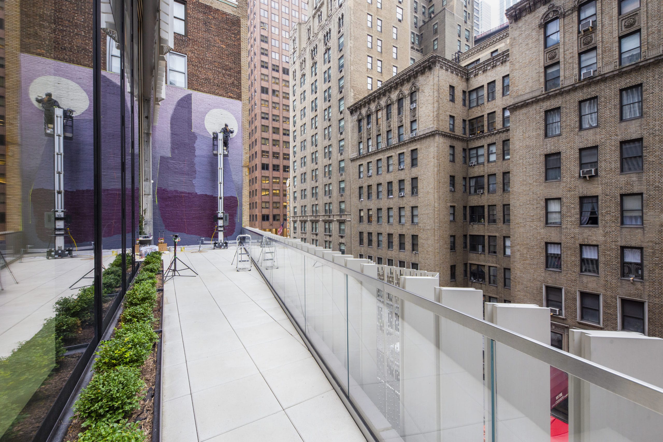 Tony Sjöman painting the mural at the Centrale.
(Photo Credit: Jakob Dahlin)
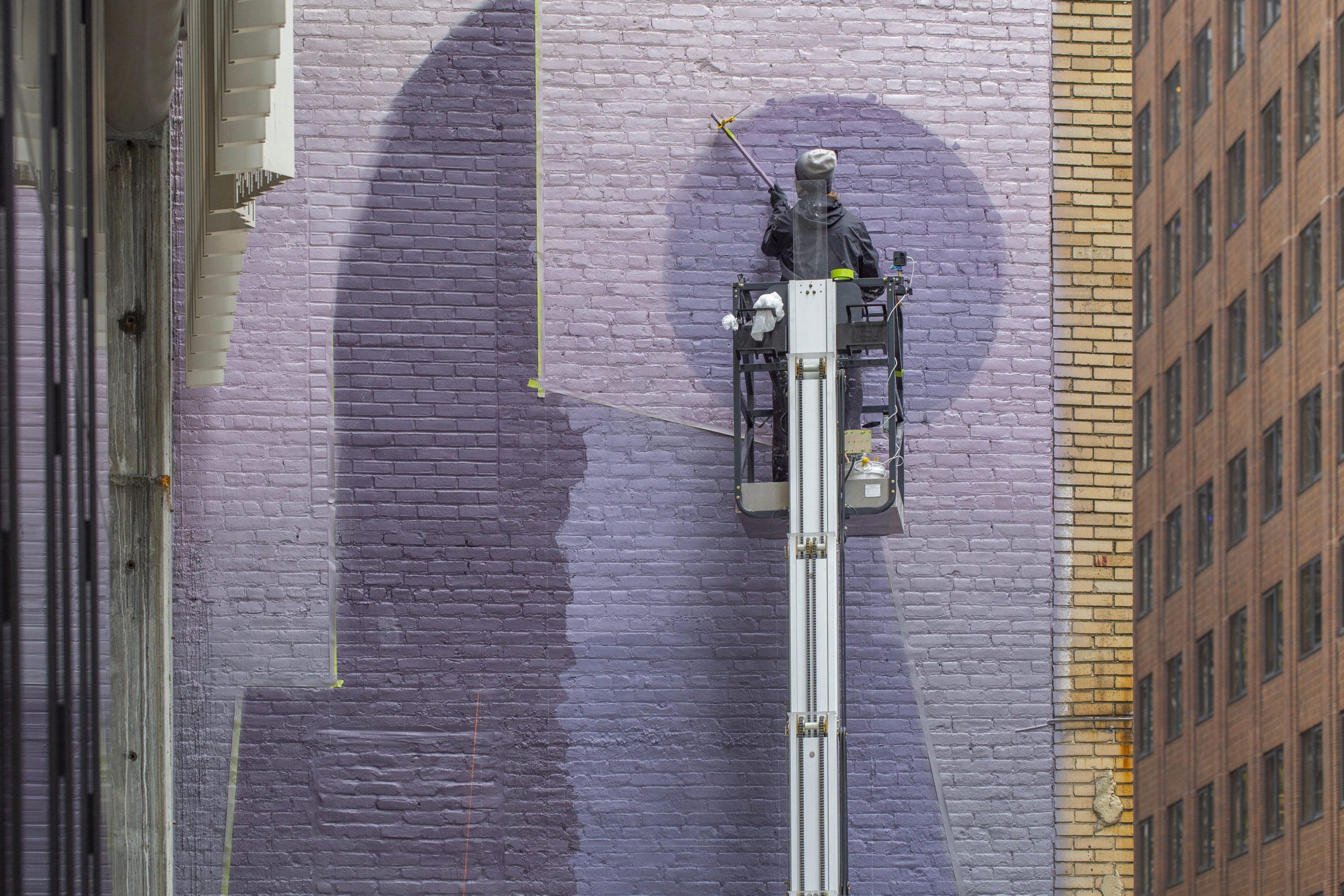 Tony Sjöman painting the mural at the Centrale.
(Photo Credit: Jakob Dahlin)
“It was easy to do with a computer, but something I haven’t done painting because it’s very difficult,” he says. “But at the same time, I like to do something each time I paint that’s unique.”
With roots in Finland and Sweden, Sjöman’s work often draws from his upbringing around classic Finnish designers and the brutalist architecture of the town where he grew up, as well as the work of architects like Alvar Aalto and Eero Saarinen, who flawlessly married form and functionality.
“What I do, it’s not only about making something that looks nice; there’s also a functional part of it too,” explains Sjöman. “I transform spaces. I often hear what I do has a calming effect”—something that’s much sought after in chaotic city life.
“If what I do makes someone stop for a little bit and take away their attention from looking at their phone, that’s the biggest compliment,” he says. “It’s not really about if what I do is good or bad. It’s about making you feel something.”


