Ryoko Okada of ODA: ‘We Tackle Each Project In a Very Different Way’
By: LX Collection
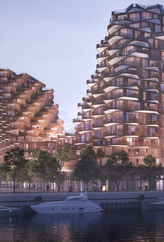
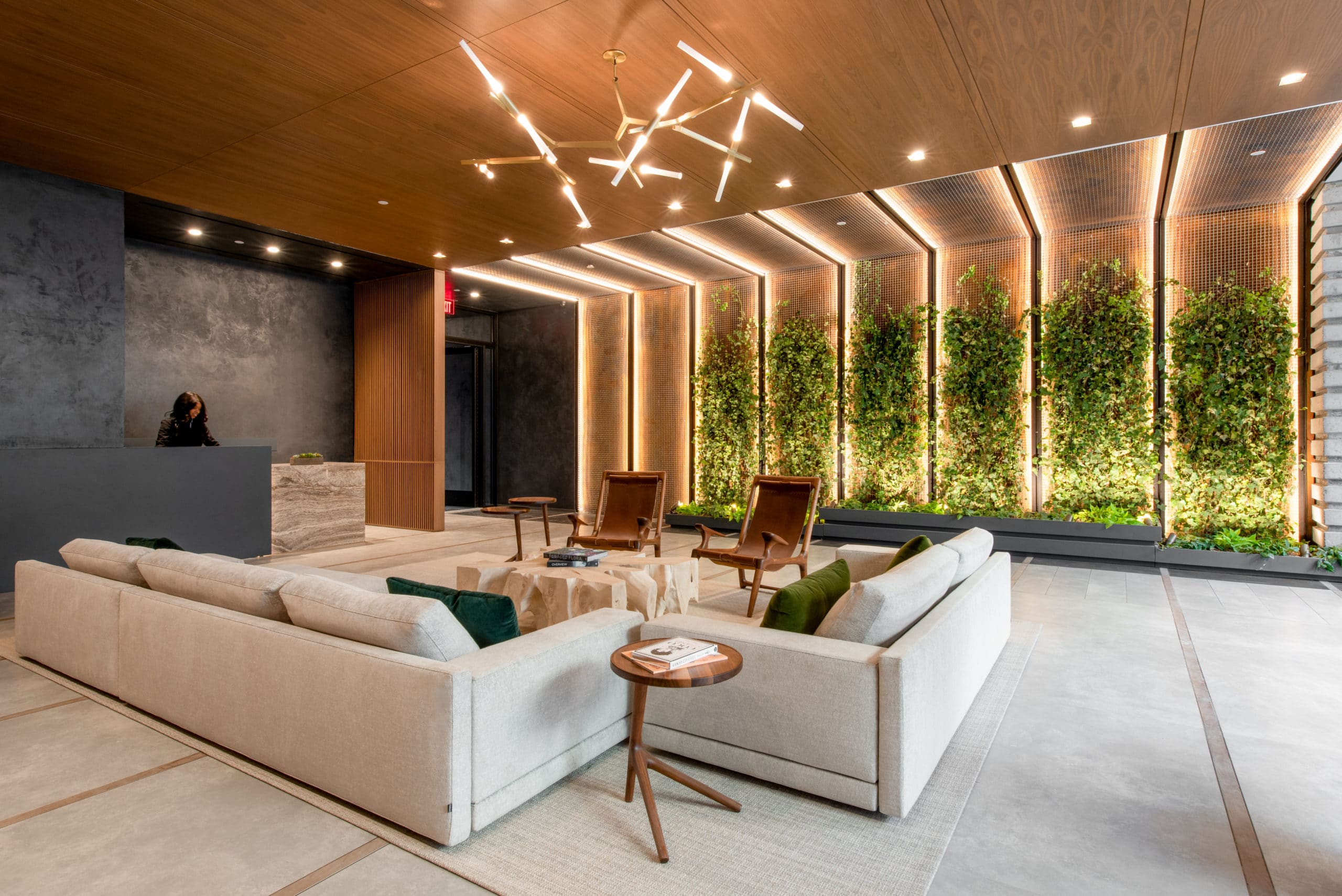
Interaction with nature defines ODA New York’s visual identity. The stacked, Tetris-like buildings that are associated with the 14-year-old firm help maximize their access to natural light, fresh air, and outdoor space. That connection to nature is also central to the design philosophy of Ryoko Okada, ODA’s Principal and Director of Interior Architecture. Okada engages with the natural world by using rare earthen materials to create schemes she describes as timeless. This intentionality is on display at one of the firm’s most recent condo projects, 561 Pacific in Brooklyn’s Boerum Hill neighborhood.
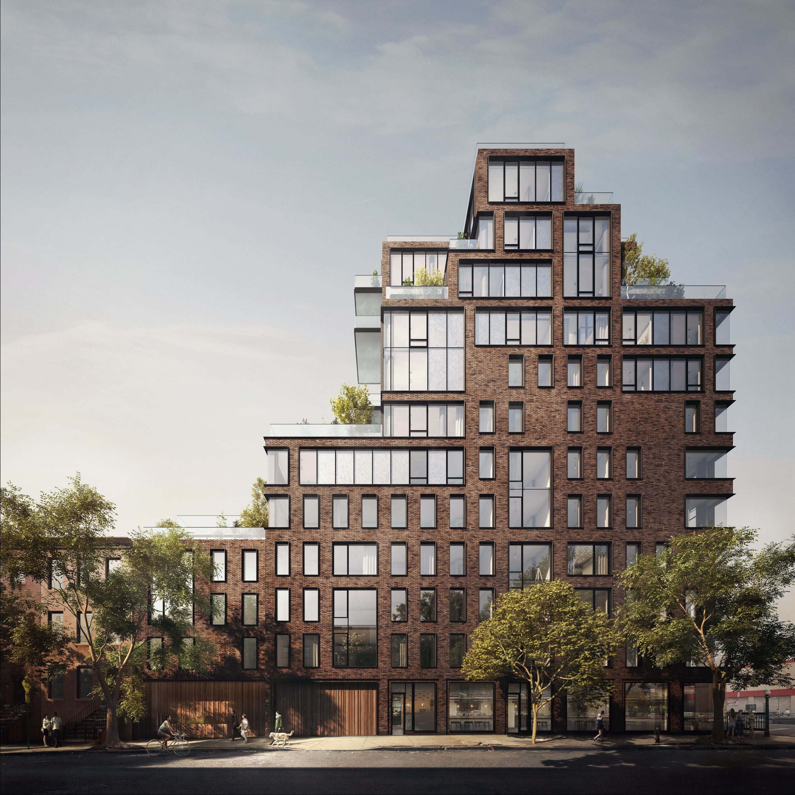 Photo Credit: Forbes Massie
ODA has been expanding its global footprint. In Rotterdam, the firm is reimagining the city’s beloved and landmarked former central post office into a residential, retail, and hospitality destination. Okada says the project presents an exciting exercise in working contextually.
You’ve had a distinguished career that’s led you to ODA. Can you tell me a little about how you got here?
My background is industrial design. I have a long history of doing very different types of projects. I was initially interested in corporate designs, hospitality, and theaters. Residential came later. I met Eran [Chen, founder of ODA New York] at Perkins Eastman, which I left to briefly work for Jeffrey Beers. But Eran decided to establish ODA, and he asked a few people to join. It was a very exciting opportunity for me to continue developing our approach.
How would you describe ODA’s design philosophy?
We struggled with having a particular style at the beginning because our approach to design is very contextual. We don’t like to have a preconceived notion of what a project should be. So we tackle each project in a very different way. It could be inspired by history or location or the client; many different things change the approach.
We started to notice years ago that our style really comes from the idea of transparency, the connection between in and out, connecting nature and neighborhood. We design buildings by really looking at problems or functions and how space flows. We also try to bring nature into the interior. The space becomes very dynamic because we like to play with height and natural light, the flow of air and space, and natural materials. So, in a way, the interior architecture is very simple. And that brings it more of a timeless look. And then each project brings the character, whether it’s a rental, a very high-end condo, or hospitality.
561 Pacific, one of your most recent projects, drew upon a “Japandi” design sensibility, using wabi-sabi elements that reflect natural warmth rather than machined perfection. The design also emphasized a connection to nature. Can you tell me how those things are on display at 561 Pacific?
When we started the project, we analyzed the neighborhood and history. This building is at an interesting location. It’s in Boerum Hill, Brooklyn, a very charming and historic neighborhood, but it’s near a very upcoming, commercialized busy cross avenue. We wanted to have something that transitions from that to a different kind of feel.
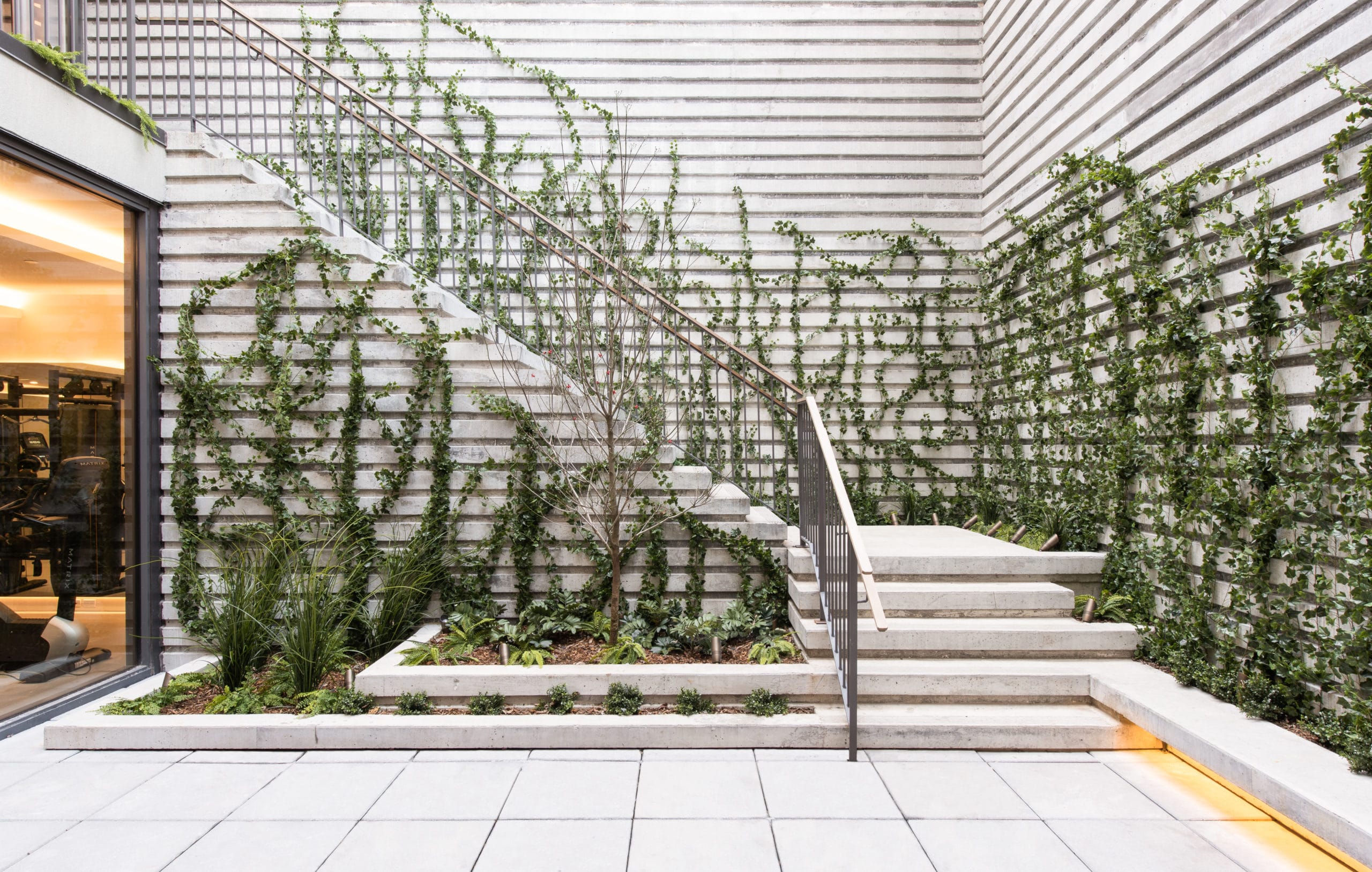
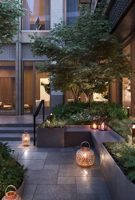
From Fourth Avenue, you come onto Pacific Street, and the entrance is very discreet but welcoming. The lobby is a transitional space with a courtyard at the rear. When you open the door, you’re already sort of coming into the garden. One thing I really love there that we were able to do is the ivy path in the lobby. We bought pre-grown ivy because we didn’t want people to see a bare structure at the beginning. I’m very interested to see how that grows over the years. I’d like to visit and see how the ivy’s doing. It almost feels like our child. I hope they love it and take good care of it.
Japandi style came naturally; we felt it was a good fit. The mixture of the finishes and keeping elements simple was important, but we also have this dynamic interior architectural gesture. When you do that simplicity with materials, you also need a lot of textures. We tried to keep as many natural materials as possible so the project would age well. I think that’s where people see that wabi-sabi element coming from.
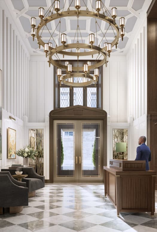
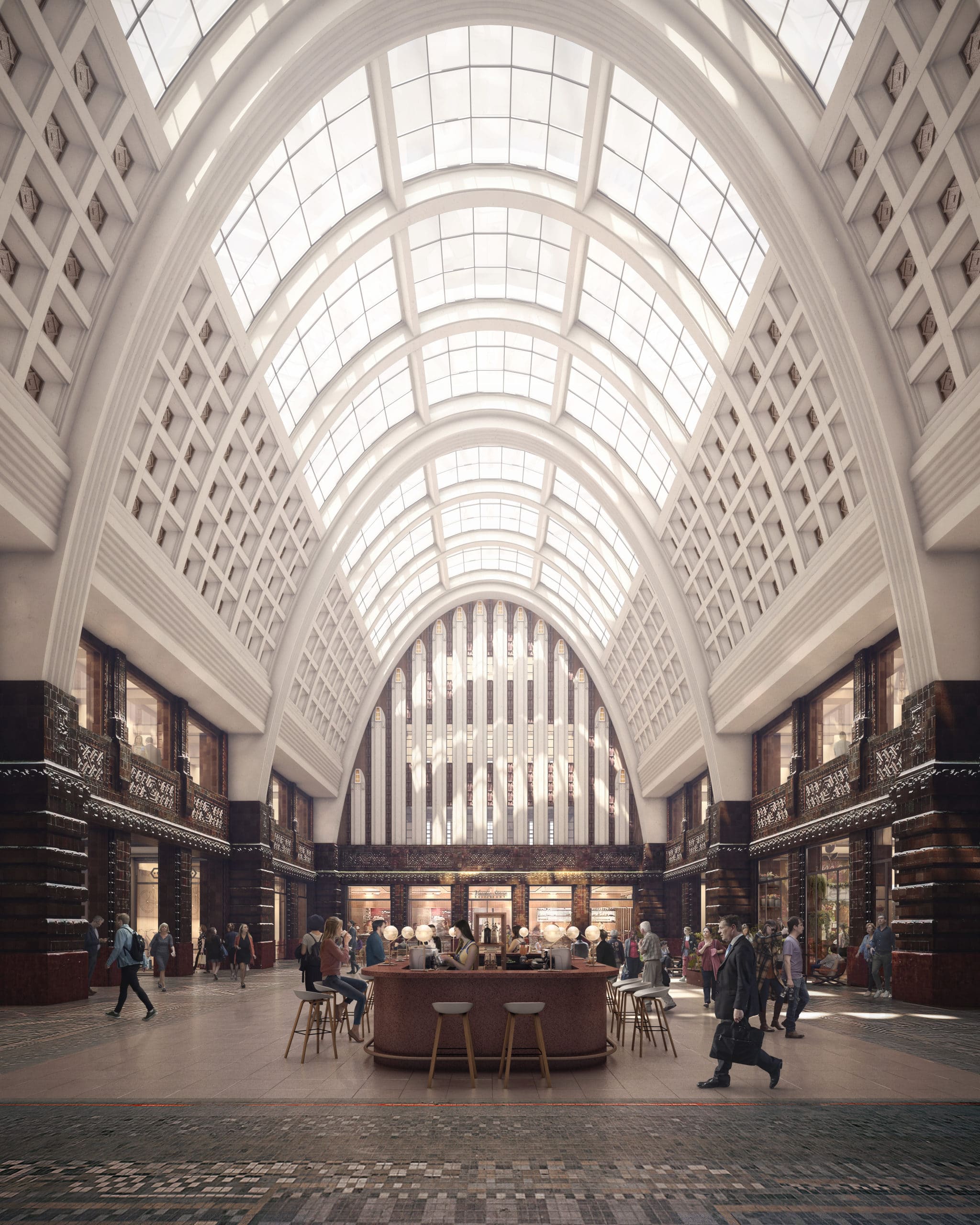 Photo Credit: Great Hall at POST (Forbes Massie)
What are some other projects you’re excited about at the moment?
One of the projects we’re very excited about is an ongoing hospitality project in Rotterdam. The building is the former post office, so there’s already a lot of character there. And it is also a landmark, so there’s a lot of elements we need to keep. We’re trying to bring in fresh air and we’re trying not to be typical and bring in expected elements. We want to go much deeper. We’re trying to bring in this notion of the letters and the inks. You know, old-fashioned. When we decided that was the concept, it was very exciting because it’s very abstract, and we can interpret it in many different ways. It’s especially interesting to see this existing building and how we can bring it up to something contemporary, keeping that aesthetic. People love that building, so we’re trying to respect that.
How do you think the pandemic will inform interior design in cities in the coming years?
I think people are just waiting to get back to what it was. But at the same time, I agree that how we live and work will change drastically. We already have requests from some of our ongoing projects to add balconies or change some layouts to add an alcove or home office or be more flexible to be able to convert. We’re also really excited about people realizing it’s very important to bring nature into your home. It’s just so necessary if this happens again, but in general, it makes a space much more livable. We’ve been doing that for a long time, and it’s exciting to advance that idea.
Is there any design innovation happening right now that you’re particularly excited about?
Now that people are staying home, they realize they want to bring nature into their living environment. I think that lighting is a very, very important element of design, and the quality of lights is improving in terms of trying to mimic natural light. You can arrange the temperature of the light so that deep inside of the home, it can have the quality of sunlight in this subtle way. These lights really bring artwork more to life too. It directly influences interiors because interiors are all about colors and textures and feeling.
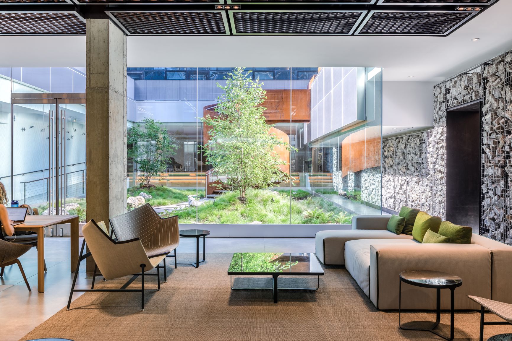 Lobby and Courtyard at 420 Kent, New York, NY.
(Photo Credit: Petrini Studios)
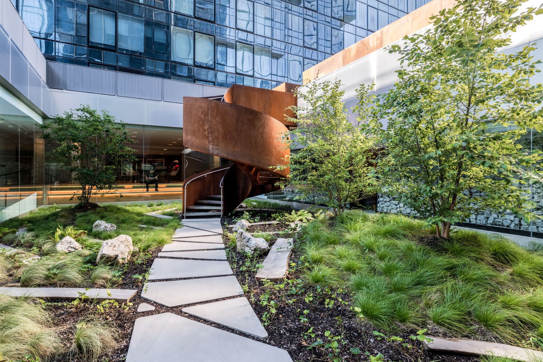 Courtyard at 420 Kent, New York, NY.
(Photo Credit: Petrini Studios)
What’s inspiring you the most right now? Design-related or not!
Nature. We’ve started doing a lot of projects outside of New York, and it’s just amazing. I was working on a project in India and trying to see what’s there and looking at their soil. There were so many enriched colorations within the soil. It’s almost like they were spice powders but muted. Everywhere we go, when we look at geographies, it’s very inspirational to me.
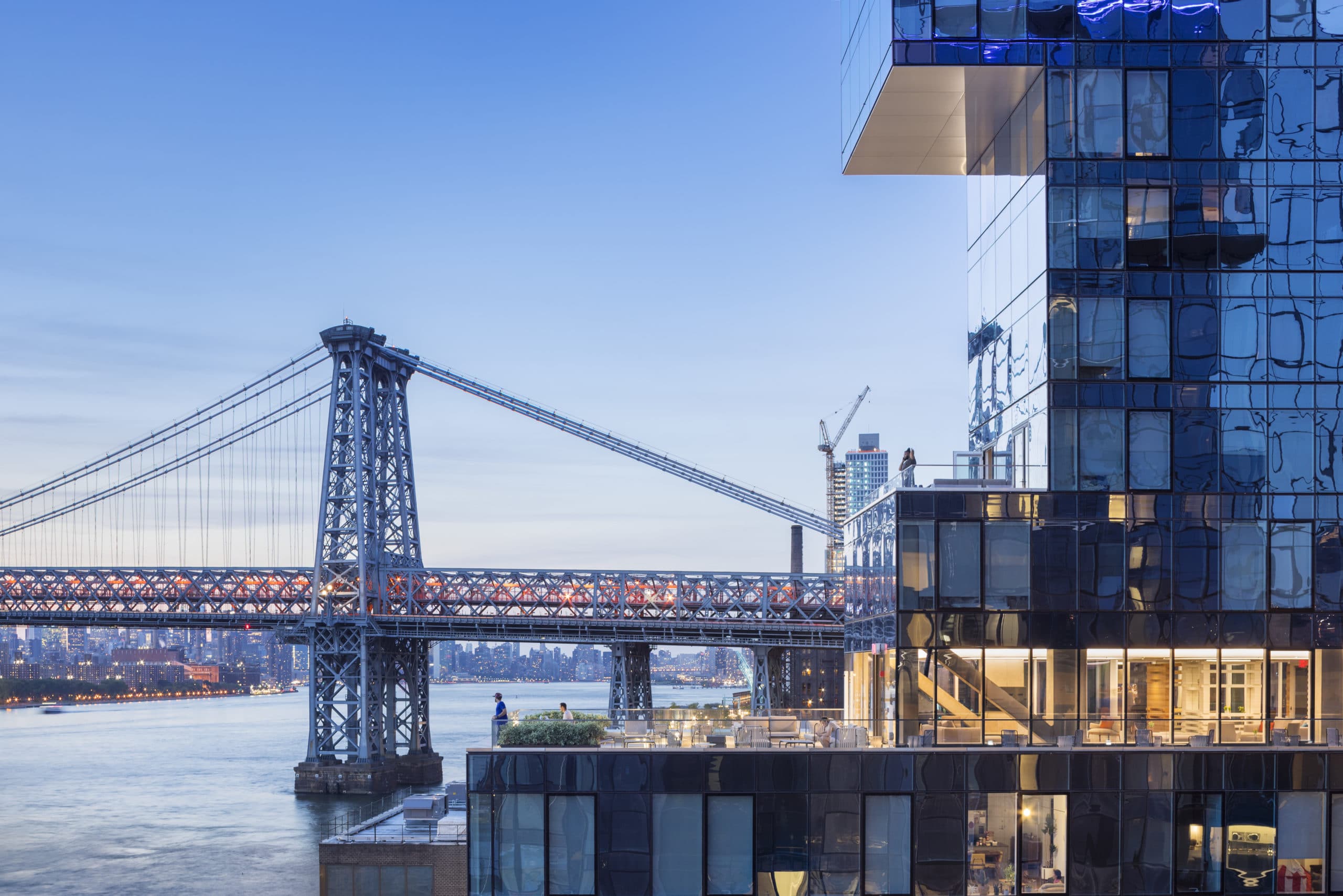 Photo Credit: 420 Kent (Albert Vecerka)
What cities are you most excited about working in right now?
Personally, I love New York. This last year the city was very quiet, not happening. But I love working in New York City because it’s a dynamic city, and it keeps evolving, changing. And it’s interesting, very interesting to see how this year turns out with people coming back.
What’s your favorite design element in your own home?
When I started living there, I bought this black marble slab with a subtle vein and made my own desk. Last year, because we were working at home, I was using it every day, and it just started to get more and more character. I love it because it started very clean and almost had a precious look. And now it’s getting more stained and scratched, but it’s part of my history.
Interview has been lightly edited.


