Jeffrey Beers, Prolific Designer, on Pushing Boundaries in New York
By: Zoe Rosenberg
Jeffrey Beers has helmed his namesake architecture, design, and planning studio since 1986, shaping it into one of the most sought-after firms for hospitality and residential work today.
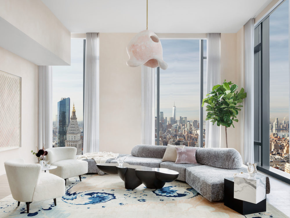
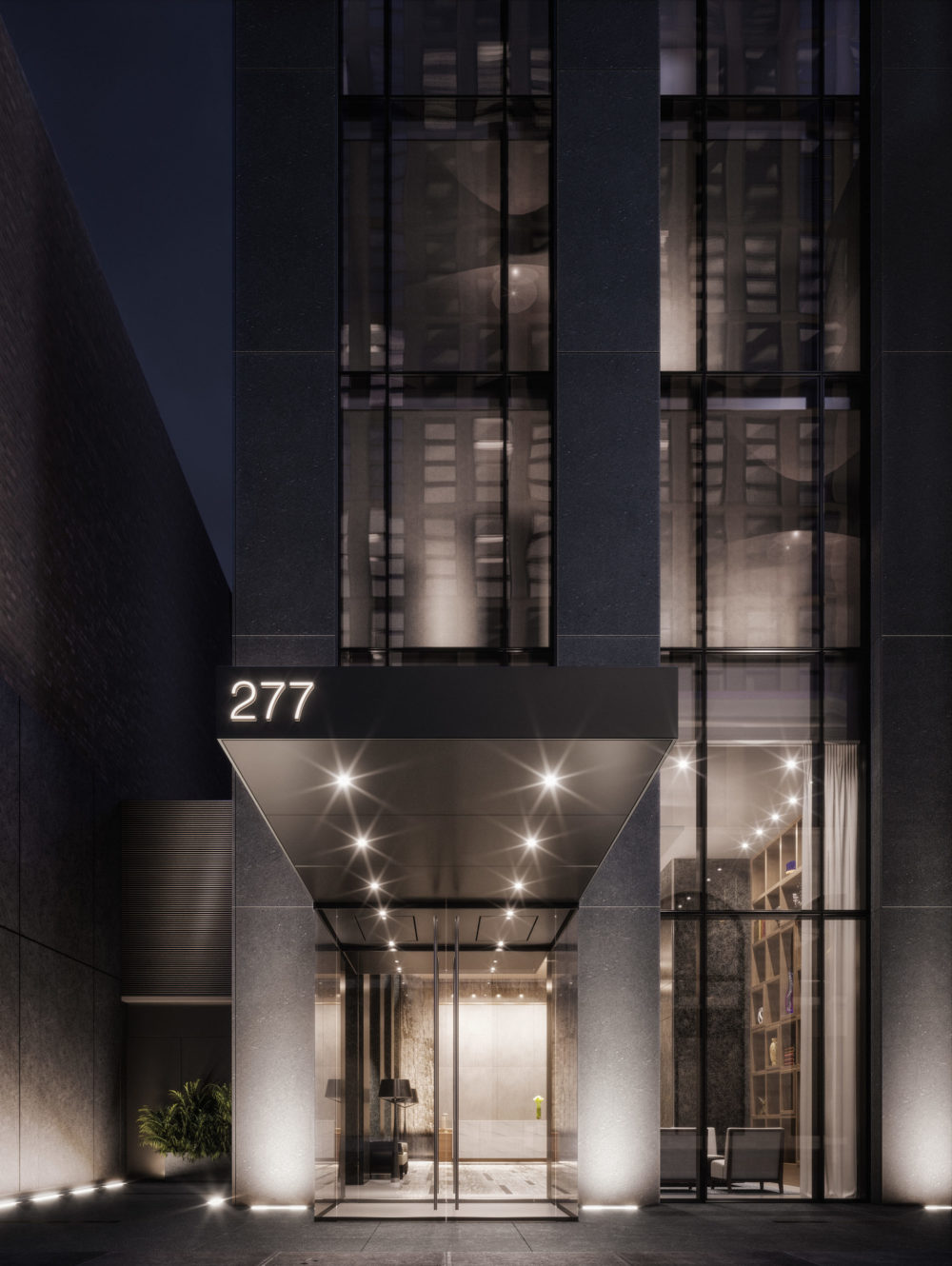
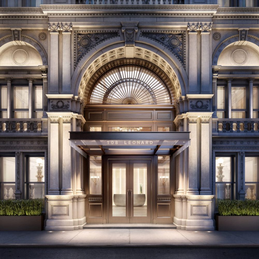
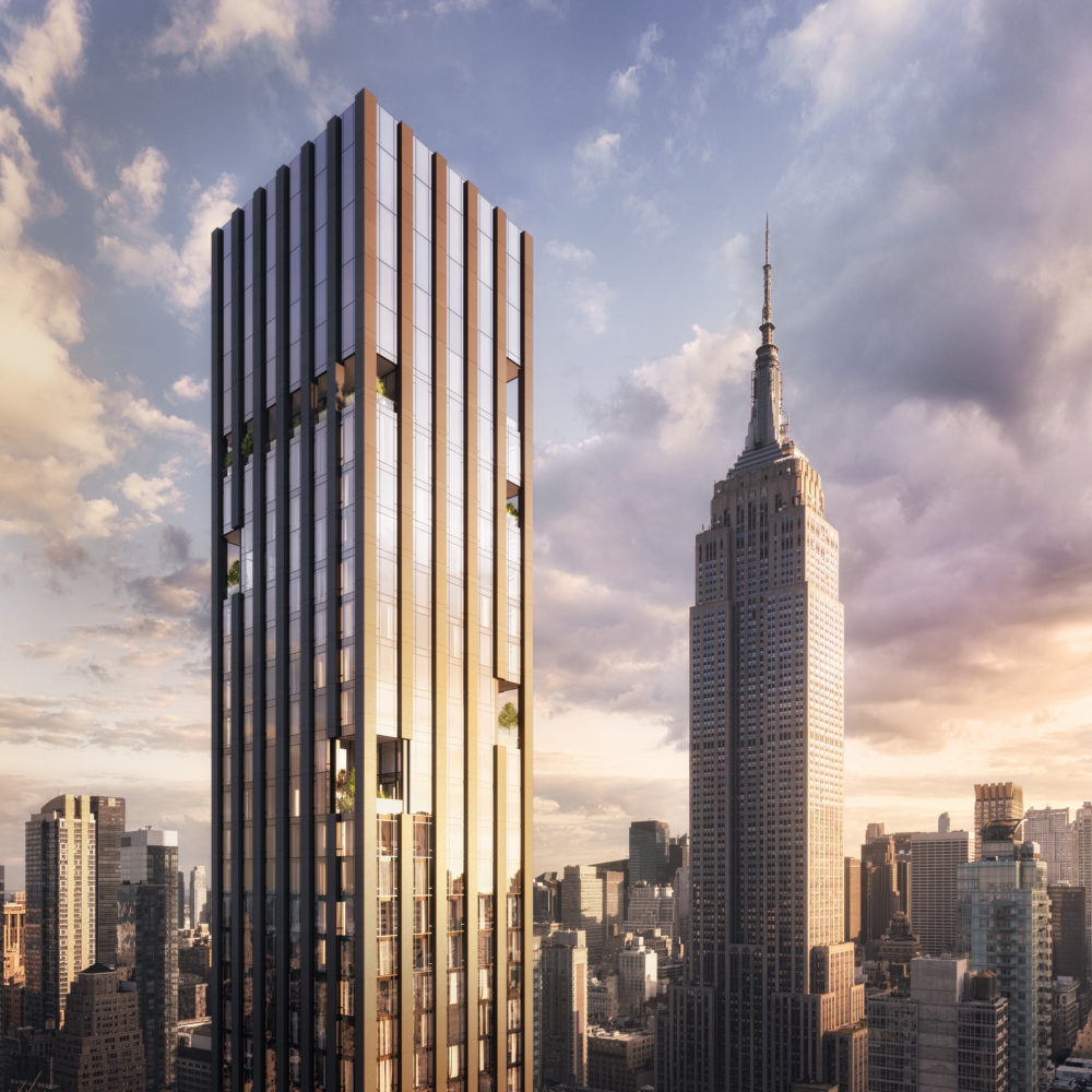
With projects spanning the globe from Chicago to Seoul, the studio lives up to the name of Jeffrey Beers International, but the firm is perhaps most prolific in its home city of New York, with projects ranging from boundary-pushing residential buildings such as Rafael Viñoly’s 277 Fifth Avenue to the reimagining of McKim, Mead & White’s former New York Life Insurance building at 108 Leonard into 167 luxury condos.
Beers is a lifelong New Yorker, save for stints out of the city to study architecture at the Rhode Island School of Design, where he also learned glassblowing from Dale Chihuly, and a Fulbright scholarship to study with Oscar Niemeyer in Brazil. After returning to New York, Beers worked for I.M. Pei before launching his own studio.
LXC: What are some of the considerations that go into designing in a historic building like McKim, Mead & White’s 108 Leonard? How does it differ from new design projects like 277 Fifth?
JB: As 108 Leonard is a historic landmark our team understood the tremendous responsibilities that accompanied its stewardship. Dating to 1899 and designed by McKim, Mead & White at the height of their creative powers, this masterpiece dramatically influenced the course of New York City’s architecture. With this in mind we were tasked with maintaining and celebrating the building’s aesthetic presence as well as its deep emotional resonance to the Tribeca neighborhood.
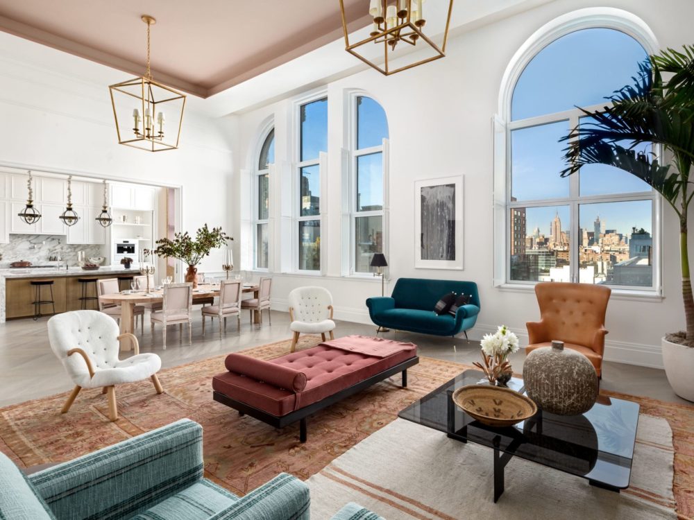
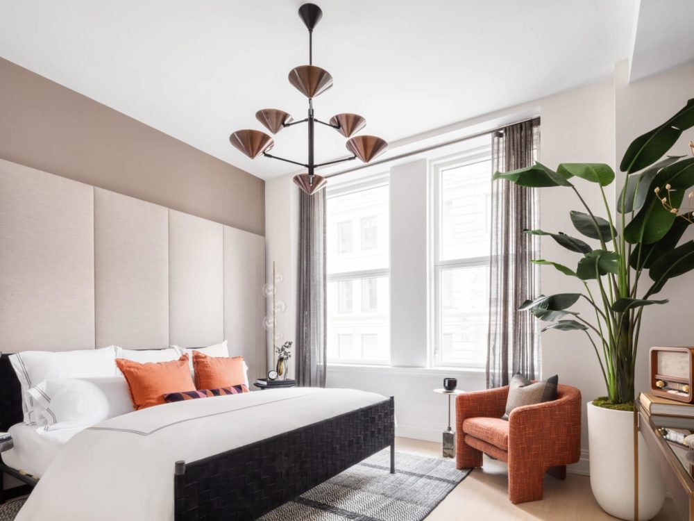
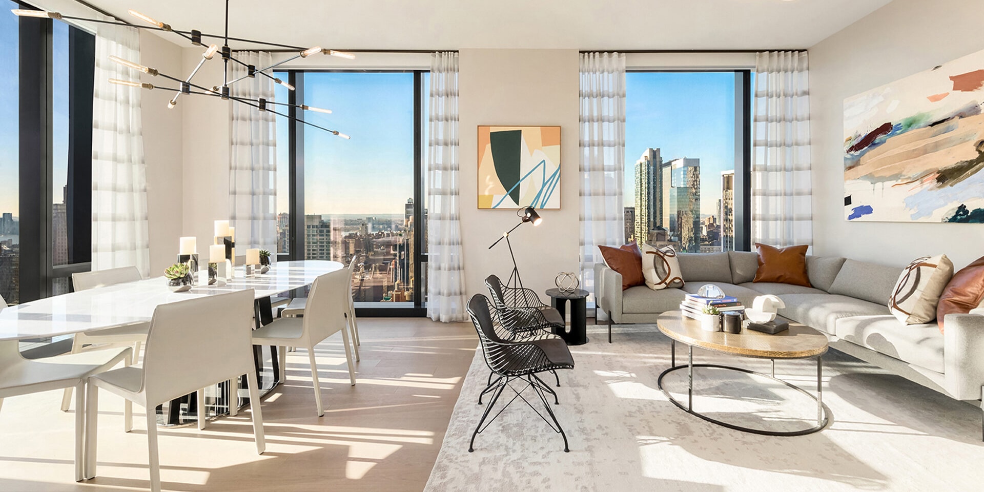
Remarkably, the interior architecture, also landmarked, is as richly distinguished as its exterior. Our job was to uncover its lost glory and bring the interior spaces to a level of sophistication not seen since the building opened 120 years ago. This incredible design feat involved taking advantage of ceiling heights soaring up to 15 feet and marrying the rhythm of the paired windows extending all the way around the building, a design process which resulted in 167 unique residences that combine today’s modern luxuries with a storied past. Topping off that story are state-of-the-art amenities which add an extra layer of opulence to 108 Leonard’s already cultivated history.
When approaching a new build like 277 Fifth Avenue, we create a design narrative based on its architecture, neighborhood, and surrounding views. We think about the residents and what they are looking for in a residential building. It is important that the design fits their lifestyle while being modern, fresh and tailored.
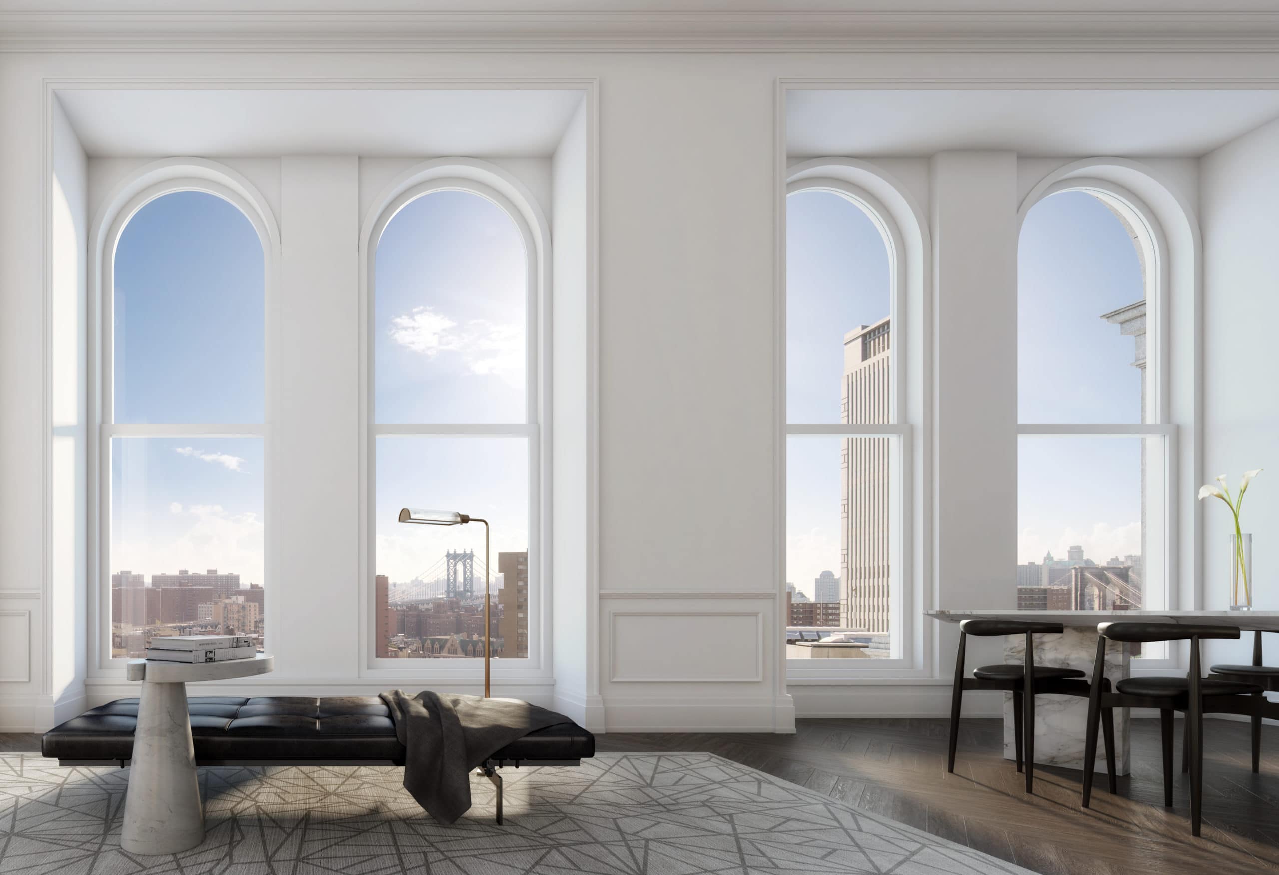 Photo Credit: DBOX
Have the limitations of working in such historic properties like 108 Leonard and One Hundred Barclay ever led to new innovation in your design?
I would not describe the challenges of working on historic buildings as limiting; they present opportunities. Many of the extraordinary materials used in the construction of these buildings are no longer available to us today. 108 Leonard and One Hundred Barclay are products of two very different movements in architecture. McKim, Mead & White’s 108 Leonard is a classic example of Renaissance revival while Ralph Walker’s 100 Barclay is an example of the Art Deco style. Due to varying ceiling heights and window designs at 108 Leonard there was an opportunity to imagine 167 layouts each with distinctive features. This would be unheard of in most new construction projects. The pairing of history and modernity comes down to our creative and talented teams. Together we constantly strove for balance, harmony and consistency between the historic details and contemporary finishes in both projects.
I’m curious about how you incorporate the most notable aspects of a building or condo into your design. For instance, with One57, how did you work with the views? What did you want to highlight with your design for 277 Fifth?
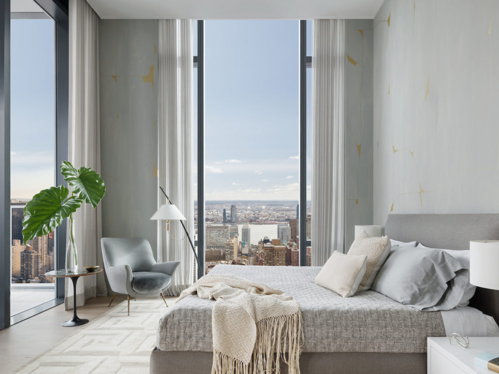
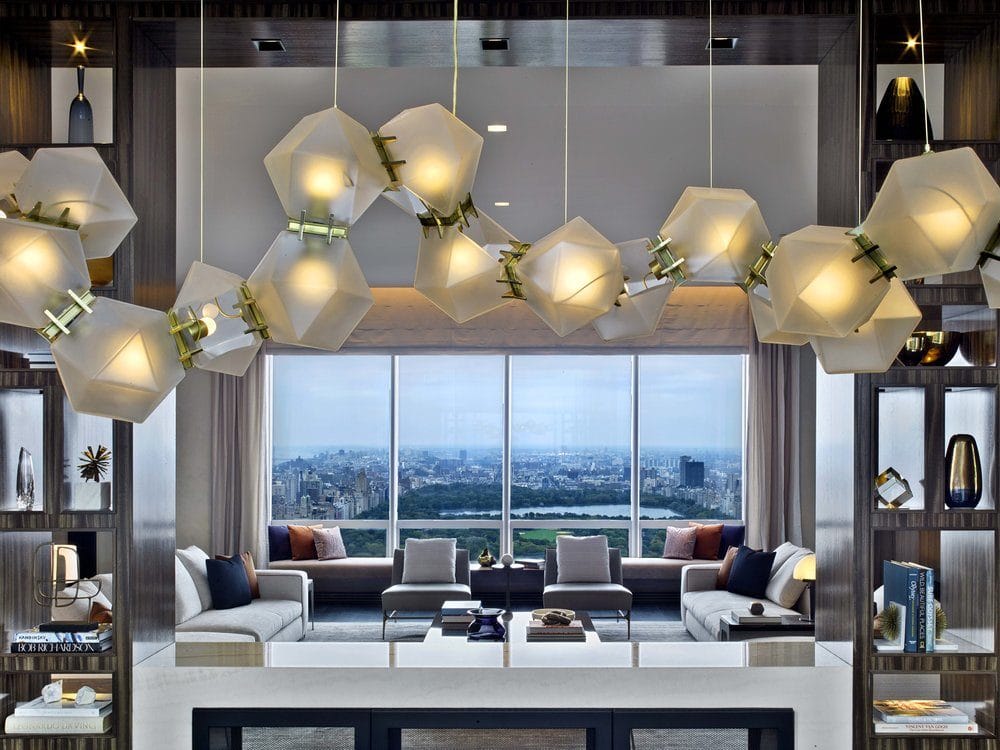
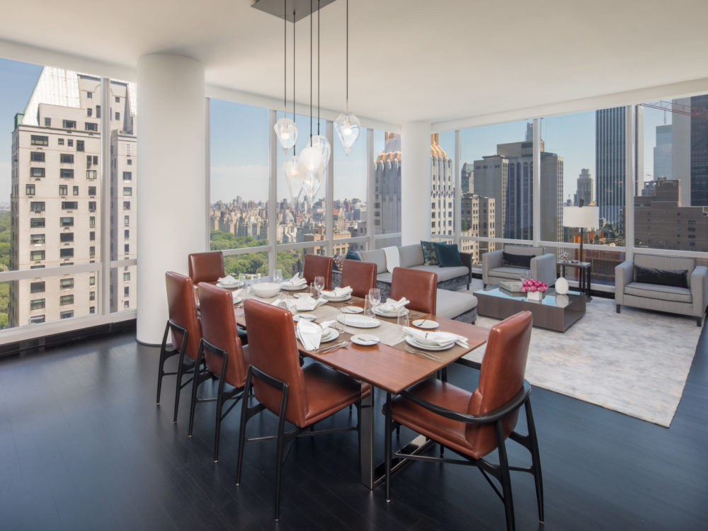
Inspiration for any design project first comes from the surrounding views and nature, as well as the location’s culture and energy. The interior design should communicate with the exterior architecture and frame the views.
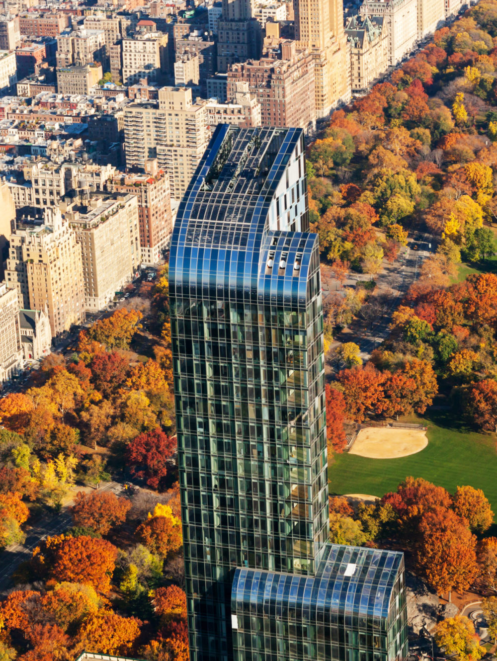
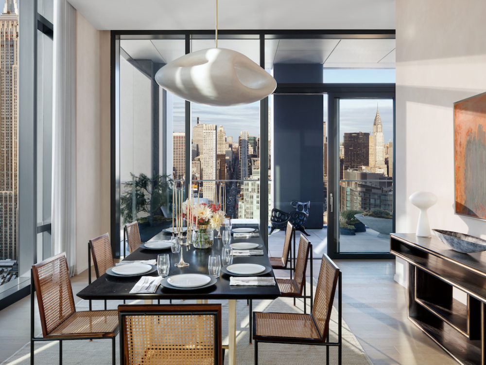
At One57, we layered the spaces with warmth and luxury, as well as provided feature moments to celebrate the views of Central Park and the impressive ceiling heights in the units. In contrast, at 277 Fifth Avenue, we took inspiration from NoMad, with its iconic Madison Square Park and the Empire State Building, and the neighborhood’s examples of Beaux-Arts and Art-Deco architectural styles.
Both fit in harmony within their surroundings and, therefore, are different in look and feel.
How do you think the pandemic will inform interior design in cities in the coming years? Beyond the obvious (offices/workstations, outdoor space), what kinds of amenities do you think will be in demand?
While at my core, I am a hospitality designer, I have grown a larger appreciation and sensitivity to what it means to work from home, especially for two-income families who are home-schooling.
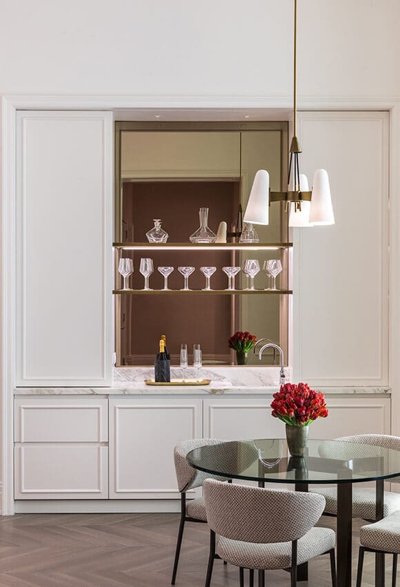 Photo Credit: 108 Leonard
Personally, I am thinking a lot about how residential design keeps the family together while also creating separate workspaces for parents and children. When it comes to materiality, I am much more sensitive to health and safety: I am now asking such questions about natural germ resistance, as well as the perception of cleanliness. The look of a place affects how you feel. A decluttered, light-toned, and spacious room will give the impression of cleanliness, while glass chandeliers and dark stained oak will give the impression of luxury.
What do I forecast in terms of future design trends and approaches in both residences and in amenity spaces? A secure entrance into the residential building and more thought to layout and sanitization (in service entrances, corridors, and storage spaces). A decrease in amenity spaces and an increase in apartment footprint to allow for individual workspaces. Open layout versus walled-off individual rooms. As an architect, I will always favor an open layout between the kitchen, dining room, and living room. Yet, I cannot ignore the fact that an individual dining room, for example, can make a great space for working remotely.
Is there any design innovation happening right now that you’re particularly excited about?
Seeing on the news how the lockdown in spring benefited the environment has made me more sensitive to our choices in materials and sourcing. I would like to deepen my knowledge of sustainable products like hemp-fiber materials, reclaimed woods, and plastic-free solutions.
What’s inspiring you the most right now? Design-related or not!
The belief that New York City, the place I have called home all my life, will return better and stronger in the near future.
What cities are you most excited about working in right now?
Hard for me to say as we have several exciting projects in the works across cities in the Middle East and Asia, such as Dubai, Beijing, and Seoul. I would love to work in London again as well as have the opportunity to design in one of Italy’s iconic cities.
What’s the number-one upgrade you would recommend?
Never underestimate the importance of good lighting. You can easily adjust the mood and character of a space with attention to detail on lights.
What’s your favorite design element in your own home?
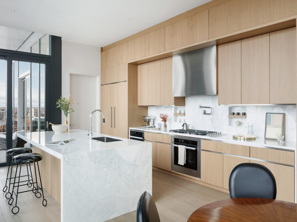
The JBI custom-designed kitchen at my new home in 277 Fifth Avenue. It exemplifies our knowledge of culinary design and needs, as well as our strengths in creating handsome, tailored, and inviting spaces.


