Creating a Backdrop for an Art Collection
By: Carly Olson
Designing living spaces for art collectors takes two rare and special qualities: finesse and humility. For clients with a treasure trove of works waiting to be displayed, design and architecture are meant to create a serene yet engaging backdrop for the art, not compete with it. Still, the stewarding job of the interior designer and architect is critical. Like a florist turning foraged branches into a dazzling centerpiece, in the right hands, beauty can reveal itself anew.
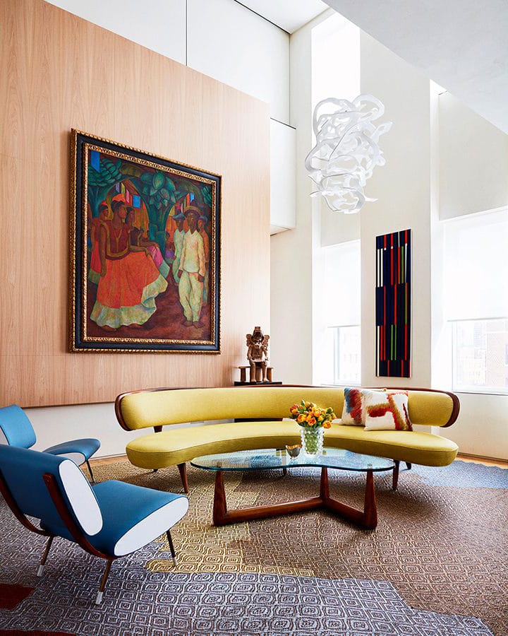 Photo Credit: Thomas Loof/Amy Lau Design
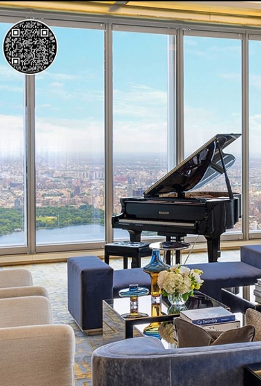
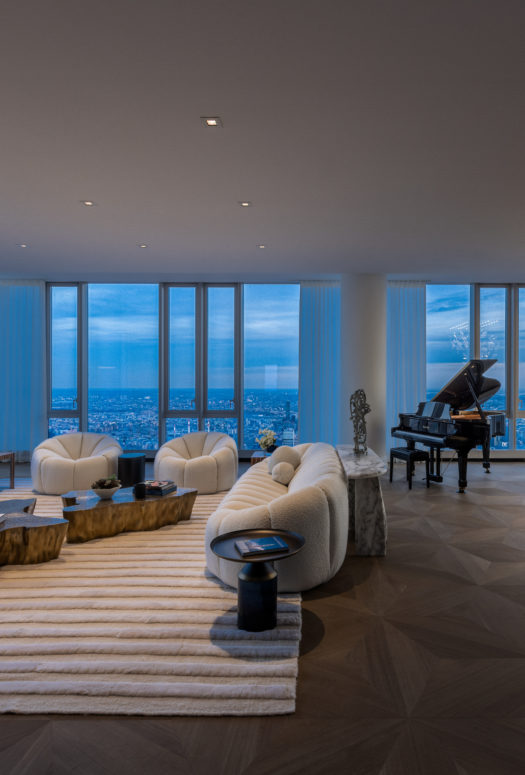
“You have to start by considering the architecture and the light and the best placement of each piece… This is their prized collection,” says Amy Lau, a New York City-based designer regarded as an art whisperer of sorts, who works with collectors of all kinds to craft thoughtful, inviting interiors. Lau worked with blue-chip collectors Edgar and Clarissa Bronfman on their showstopping Park Avenue Triplex, which was shown in Architectural Digest in 2016.
Such projects put designers in the unique position of focusing on furniture and layout when neither are meant to be the most eye-catching part of the project. It’s a task that is far from simple. Many designers want to be familiar with an art collection in order to exhibit the works at their best. Before crafting an interior, Lau researches the pieces in a client’s collection and asks what speaks to them about the works. She chooses furnishings to make the art the focal point, but fills a room with objects in conversation with one another. If a Fernando Botero painting is shown in a living room, Lau commissions the best Latin American rugmakers to weave the floor covering. When a Brancusi is in a sitting area, she sources the best sculptural chairs.
For Lau, a harmonious space is inspired, first, by the art on hand. “I’ve been known to sit in front of works of art with a Benjamin Moore paint deck and pick out 12 colors that possibly could work,” Lau says. “I’m trying to find something that brings a naturalness to the space.”
I’ve been known to sit in front of works of art with a Benjamin Moore paint deck and pick out 12 colors that possibly could work.
San Francisco-based designer Gary Hutton seconds this philosophy of harmony, “It’s about creating a background that is interesting, but doesn’t shout,” he says, “so my approach is to use really interesting textured fabrics.” For four decades, Hutton has worked with major art collector Chara Schreyer, designing five of her homes that house a collective 600 pieces of art by the likes of Andy Warhol, Frank Stella, and Louise Nevelson. (The duo’s collaboration is beautifully documented in Art House (Assouline), which was released in its fourth printing this summer.)
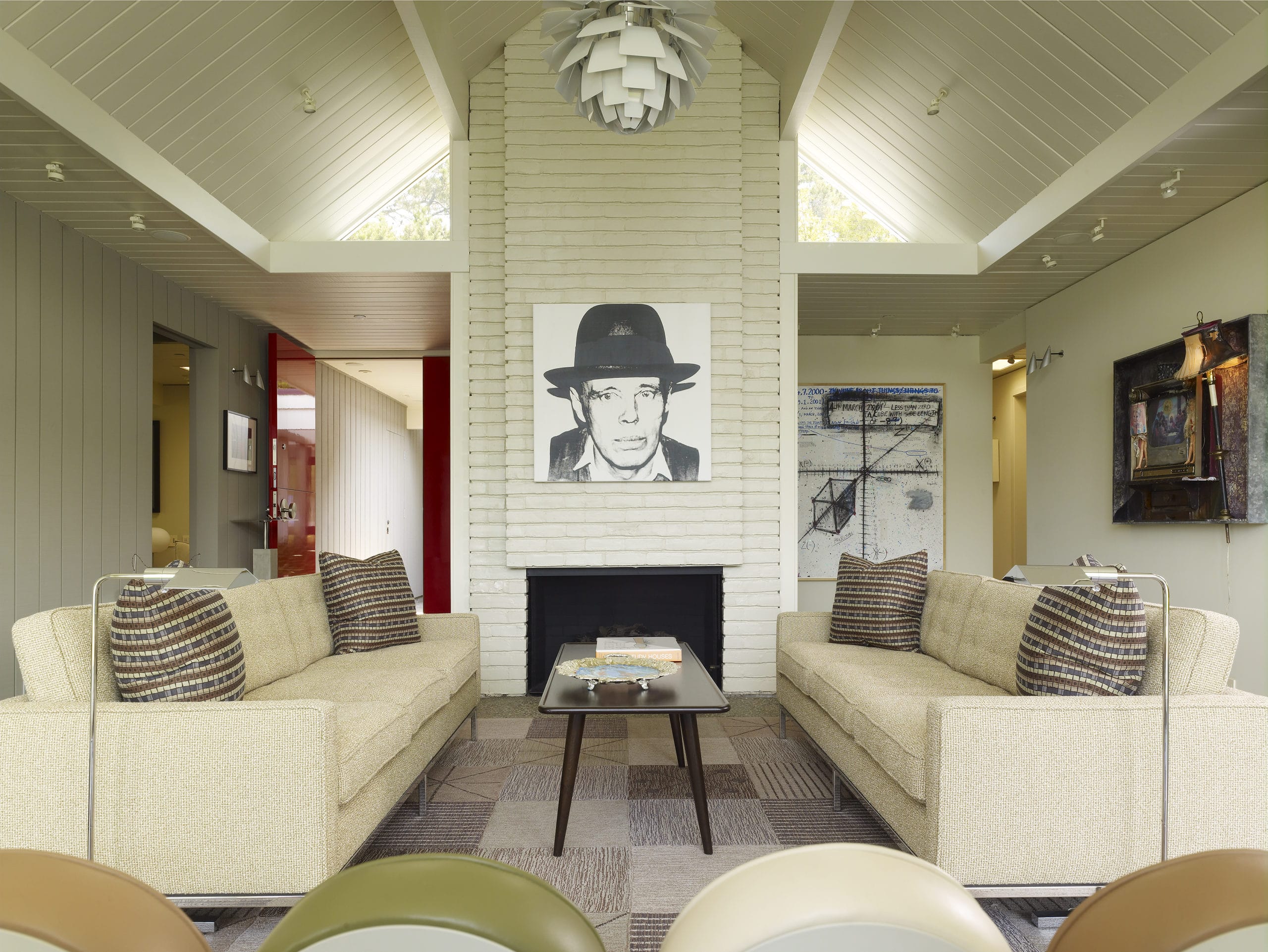 Photo Credit: Courtesy of Gary Hutton Design
In Schreyer’s Tiburon, California living room, the walls are a slightly splintery gray-stained wood. Hutton used a shaggy Jack Lenor Larsen fabric for the Roman shades that, when closed, nearly match the color and texture of the walls. “When the shades were down, you couldn’t really tell what was wall and what was curtain,” he explains. This adds a level of intrigue to the interiors while preserving them as a canvas for Schreyer’s art.
Both designers agree that maximalist rooms don’t work for their collector clients. “You just never want to overpower with too much design, too much color, or too much layering,” says Lau. Hutton is similarly certain. “Pattern is anathema to most collectors, I’ve found,” he quips.
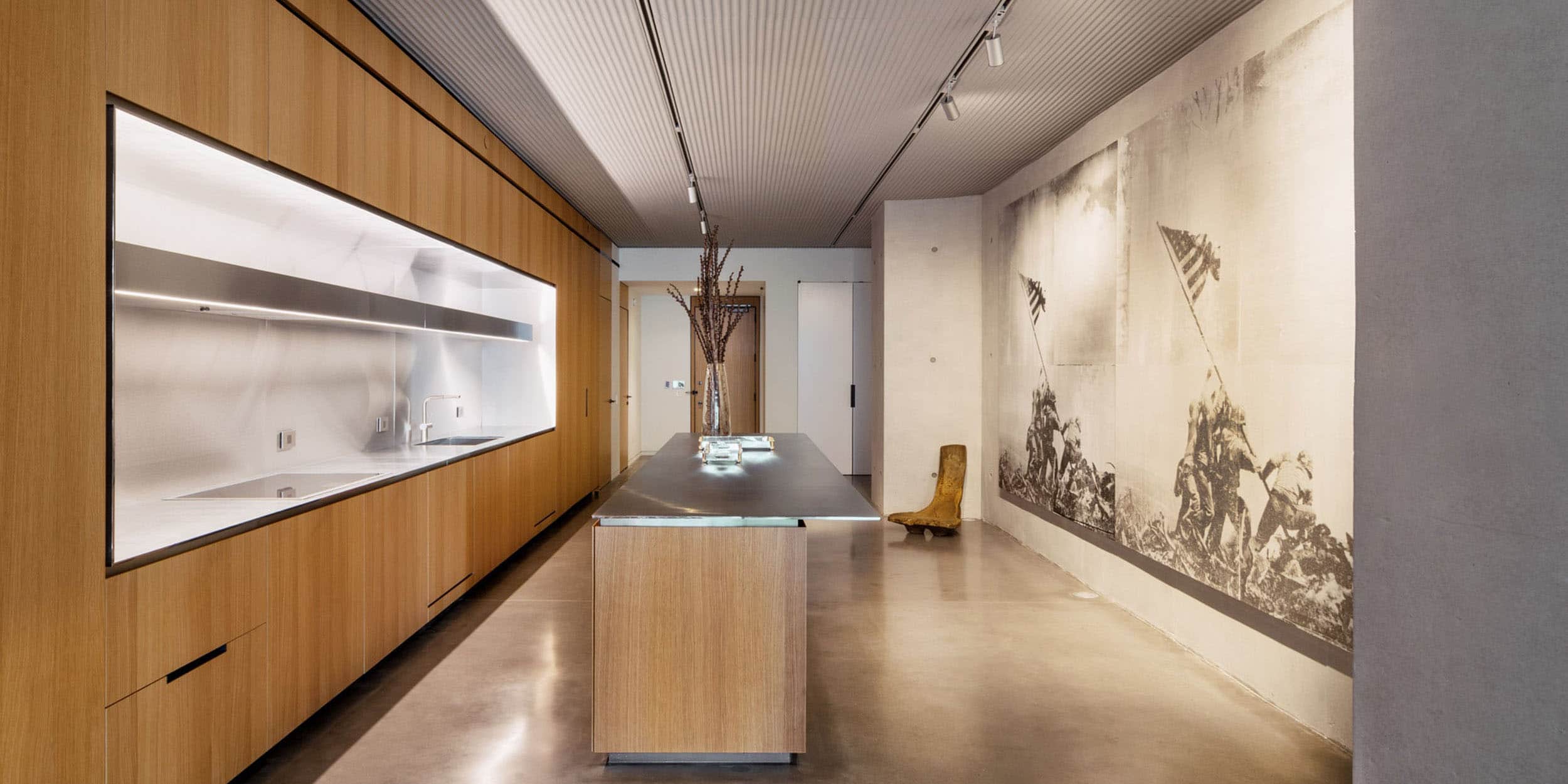
Some luxury condominiums are specifically designed with collectors in mind. One such project in New York City is 100 East 53rd Street, a Foster + Partners-designed structure on Manhattan’s east side. Certain units were conceived as “artist lofts” while other “tower units” have a more quintessential condo layout. The lofts are inspired by those found further downtown, with art gallery-inspired spaces and finishes—think architectural concrete columns, large walls specifically for hanging art, ribbed concrete ceilings with integrated gallery-style track lighting, and polished concrete floors. Even the brushed stainless steel kitchens with unstained natural oak cabinetry convey the downtown-cool vibe.
These spaces are ideal for collectors who want to display their art at its best, explains Foster + Partners’ head of studio, David Summerfield, who led the design of the project. “We ensured that the detailing was minimalist throughout with frameless doors, flush baseboards, flush millwork to help keep the focus firmly on the art,” he says.
Summerfield adds that the team took special care to make sure the lighting was just so in the units, something that’s especially important for those who collect. “The glass used throughout the facade is ultra-clear low-iron glass, which was specifically selected to provide unaltered, neutral daylighting, while keeping out ultraviolet radiation, which could damage paintings and other artworks,” he says. Paired with fully integrated linear track lighting at five-foot intervals, Summerfield notes, “This allows residents to vary their placement of art, furniture and furnishings anywhere in the residence with minimal effort and alteration.”
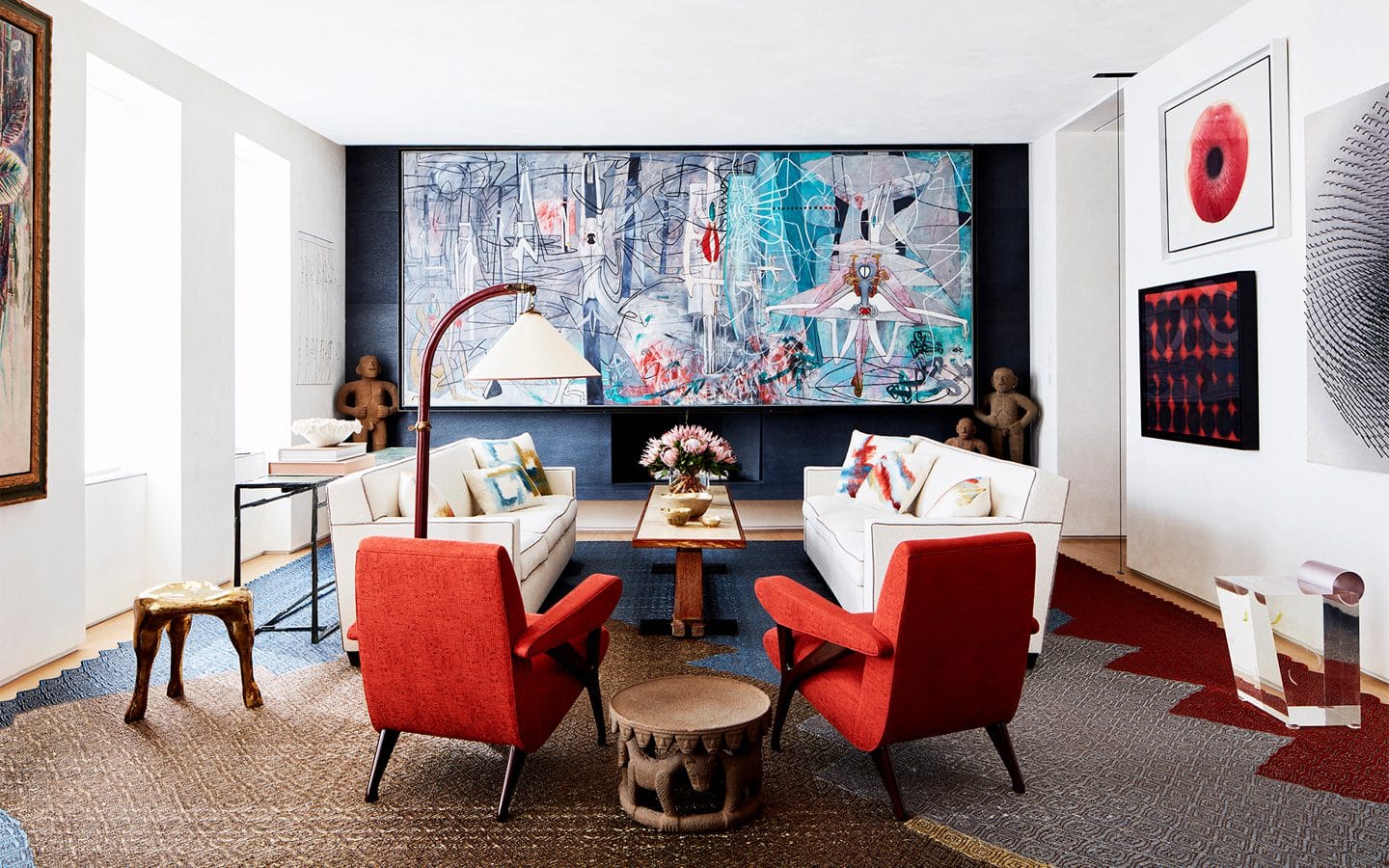 Photo Credit: Thomas Loof/Amy Lau Design
Lau and Hutton agree that lighting holds a special importance in an art collector’s home. Major collectors often turn to a lighting specialist, though the interior designer can aid in the process. Lau is known to put films over windows or look for creative window treatments to temper bright rooms that could damage works of art. For spaces that need more light, a combination of track and recessed lighting is typically in order. Hutton uses a suspended cable lighting scheme in his apartment, a flexible solution for his concrete ceilings.
Some designers who work with collectors encourage their clients to commission pieces of their own—and facilitate the process. Lau doesn’t only work with blue-chip collectors. Regardless of budget, she explains, there is an opportunity for a custom creation in one’s home, and her deep rolodex of artists—from Etsy shops to far-flung artisans—offers something for any client’s needs.
“These often become the pieces in families that get passed down from generation to generation,” Lau explains of such custom artworks. Giving the client a hand in an artistic process, Lau finds, makes the undertaking even more meaningful. “I’m only channeling the client,” she adds. “I’m listening.”


