Architect Dan Hogman on Sketching Urban Life
By: LX Collection
Architect, artist, and photographer Dan Hogman creates lively sketches of urban life in cities all over the world. When he’s not working as an architect or teaching drawing at the Academy of Art University in San Francisco, he’s catching a plane to Hong Kong or Paris to capture historical architecture.
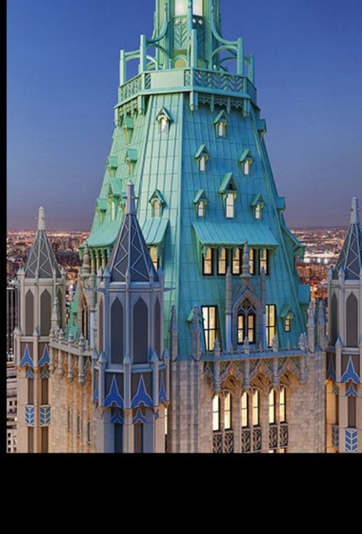
Hogman, who has contributed drawings of the Crown Building, Lantern House, and Una Miami to LX Collection, had the privilege of shaping San Francisco’s skyline with his work on 181 Fremont. Designed by Heller Manus Architects, the luxury high-rise has won more commendations than any other building in the United States, including Excellence for Best Tall Building (200-299 meters), the MEP Engineering Award, the Structural Engineering Award, the Fire and Risk Award, and the Geotechnical Engineering Award.
Hogman is even better known for his sketches, which appear in daily vlogs on Instagram and YouTube. LX Collection spoke to Hogman to learn more about his sketching process and what draws him to cityscapes.
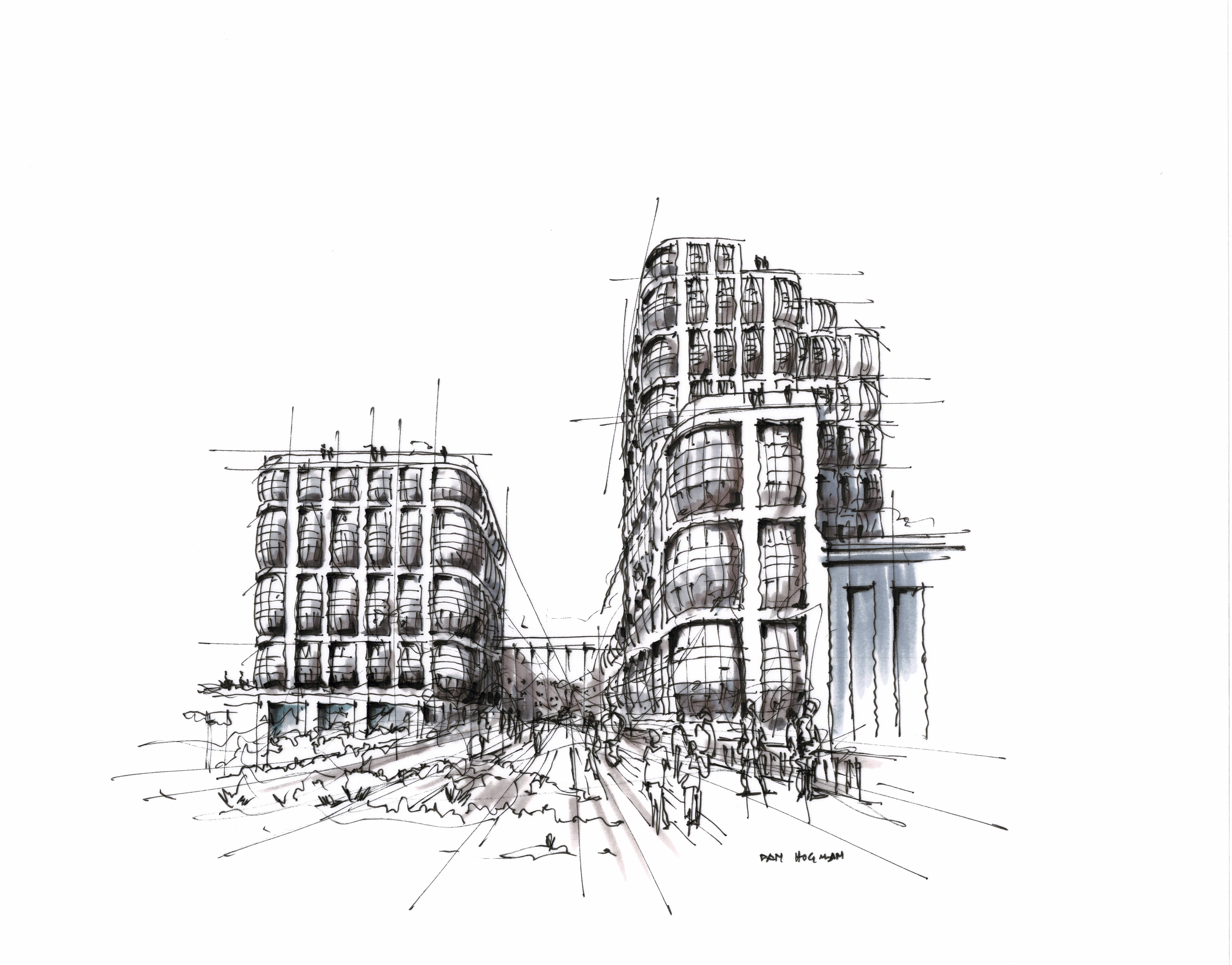 Photo Credit: Dan Hogman
LXC: What attracts you to a building or a skyline?
DH: Newer architecture is not that visually appealing when it comes to sketching. There are different areas in the United States that have been around for the past century or so, and I will sketch some of those, but they’re not always the most inspiring location. If you compare them to places in Europe, it’s a whole different story. The vibe is special.
Are there any cities that are especially inspiring?
Well, Paris, how can I not mention Paris? I tried to avoid it for most of my life because I always thought it’s really a touristy place. But I went there for the first time three or four years ago, and I was drawn. I go back every year now. So, definitely Paris, if I were to pick a specific place.
When you travel, do you decide to go to places based on what you want to sketch or is it the other way around?
Well, I think it’s a bit of both. Before I go to any city, I do my research and I know where to go, mostly by what company is there or what buildings happen to be there. That’s before I fly. Now, once I’m there, it kind of changes a bit. Sometimes the place I look at could be interesting, sometimes not so much: I take a few shots and just walk away. Many times I don’t even enter [the building] because it’s mostly to sit down and make a sketch or draw. Sometimes on my way to the place, I notice specific vantage points, and then I might return for my next sketch, which I do on-site. Sometimes I sketch over a photo reference when I get home.
One thing I noticed with your sketches is they have an animated, living quality to them. What are the different ways that you take a still life and make it come alive?
One part would be showing elements that happen to be in motion, like people, cars, landscape, around the building. Maybe more than that would be the strong perspective, strong vanishing points, and very sharp angles. So, I think it’s a mix of the two. One, the scene being animated by itself, and one, the way I choose angles or vanishing points makes it a little bit more dynamic.
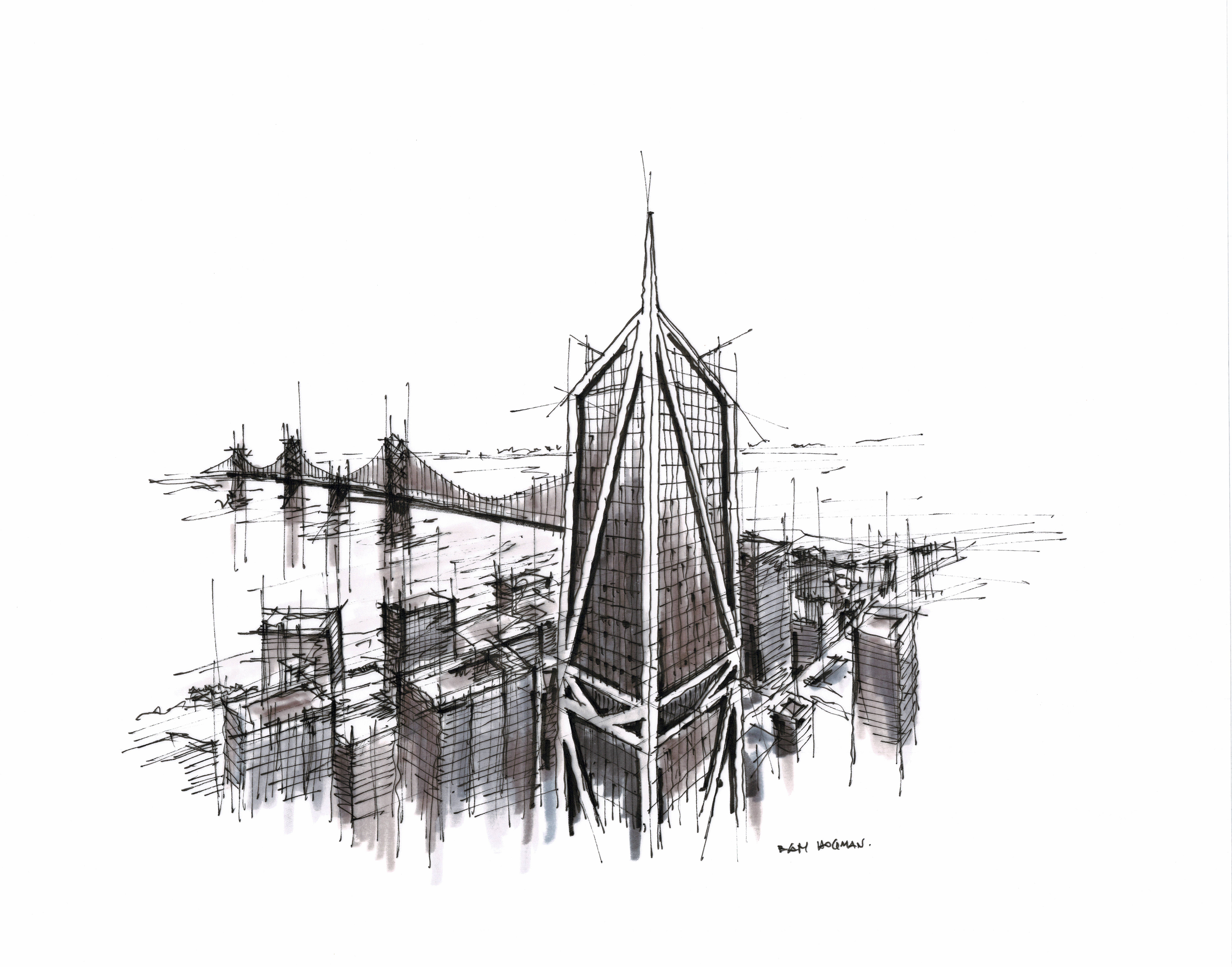 Photo Credit: Dan Hogman
How long do the sketches tend to take?
Most of them are under one hour. What also takes time is planning the sketch. It’s debating how to look at what to draw, how can I place the sun or the light. It could take an hour to work out how to record the video, but it’s still a short time overall.
Are you drawing exactly what you see or are you changing anything?
Let’s start building parts here. One is the geometry; then light would be second. When it comes to geometry, I try to be precise. You notice I don’t have any distortions when it comes to the necessary width versus height ratio. I make sure that the proportions are accurate. When it comes to light, I decide where to put the sun and how much light or shadow to cast over the subject. I adjust it quite a bit to make it vibrant. You build it case by case. It’s never the same thing.
I also saw you do a bit of photography. What draws you to photography, and how is that different from sketching?
Photography is sometimes professional work, but mostly it’s a hobby. I see photography as a parallel line next to my sketching, but they do inform each other. I can sketch [from photographs], or I sketch to plan my next photography.
Why do you only sketch in black and white?
I think once you take the color away from the drawing, the whole geometry pops off. Whether or not you need color depends on what the drawing is all about. If you’re trying to sell a design to a client and you want to send the color to design, then, of course, you do color. But in my case, this is most about showing the geometry of the location or the light and shadow over location. So, at that point, color is not quite important. It might even be better off without color.
Are there any sketching projects or professional work that you are particularly proud of?
When it comes to architecture, I was involved in several [skyline] projects down in San Francisco. Those are quite significant for a number of reasons. Of course, they change the profile of Downtown San Francisco. You can drive along the Bay and see the high-rises I was involved with, all done under my employers. When it comes to art, lots of pieces come to mind. Most of them are probably quite short… street vignettes, travel sketches. That type of work is very, very good to look at, but it just doesn’t get too far. It doesn’t get me into galleries or anything like that.
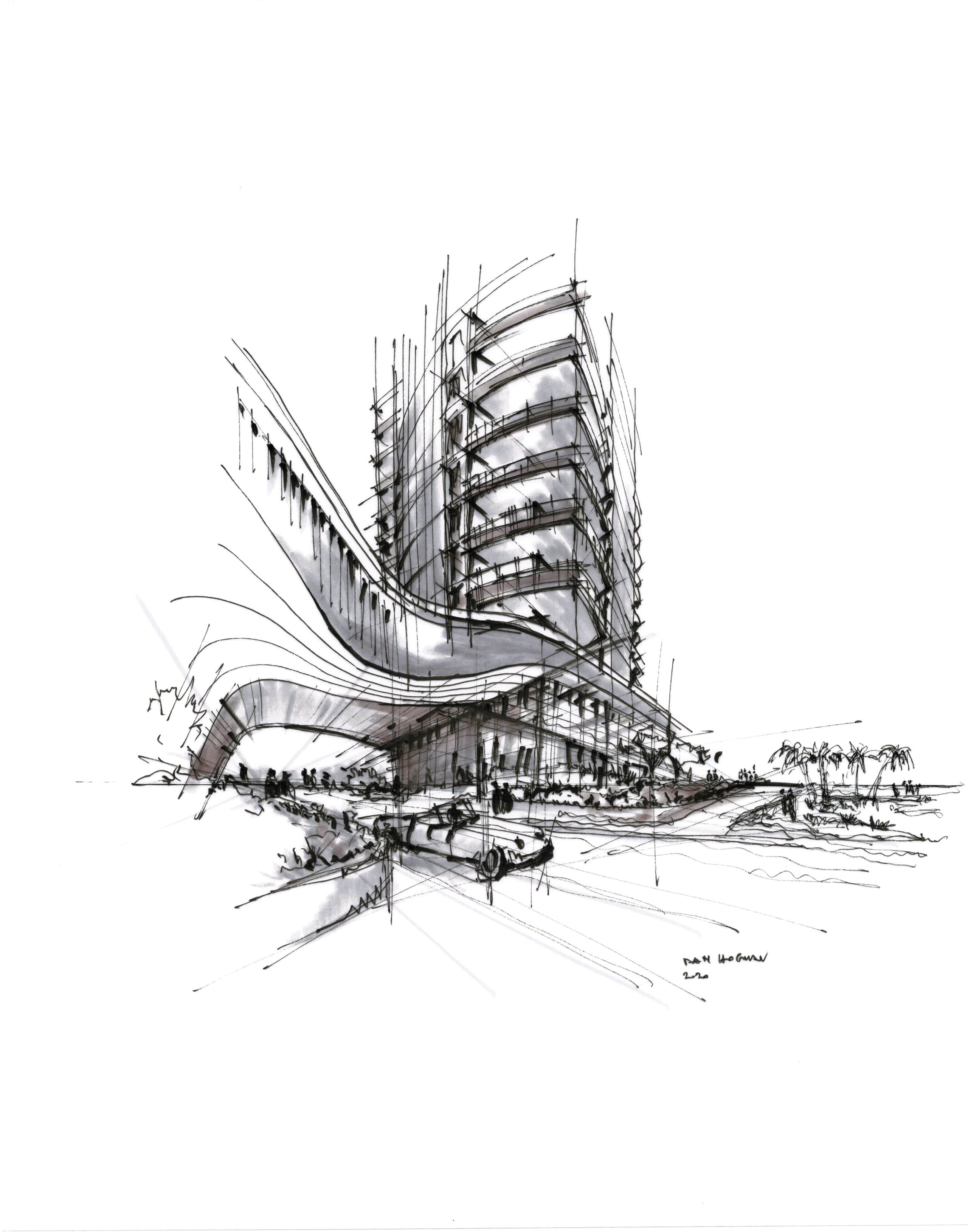 Photo Credit: Dan Hogman
Can you describe your approach to architecture?
My approach to architecture is highly specific to the site, local conditions, and building typology. Architecture has to be innovative. It has the role to shape people’s activities and, eventually, their lives, so it has to really address end-user needs. I’ve covered a whole range of typologies for the past many years now. Probably most of my work deals with high-rise commercial and residential work but also some master planning and interiors. When looking at my project list, multifamily residential comes up the most, with many projects across the US, China, and parts of Europe.
I noticed that your sketches are a mix of contemporary and classical architecture. Do you get to do any of that kind of mixing of modern and classical elements in your architecture job?
It depends. Sometimes we do things in a historical context. In that case, we have to kind of blend in. We’re trying not to necessarily duplicate or copy any of the historical context, but more to complement it by using different gestures. But if I want to put a specific detail, like say a column, that will never happen in our modern building, no matter how significant it is in a historical context.
What’s your favorite design element in your own home?
I made the mistake of designing my own home. I call it a mistake since I believe architects should not design their own homes. It’s too personal. There are some interesting moments in my current house: the way it receives light, the way it opens to the outdoors, the way the air flows passively, and so on. The heart of the house remains the fireplace. This is true with my house as well as most houses I’ve seen. It’s a functional, a social, and an aesthetic piece.


