These Inspired Lobby Designs Prove that First Impressions Matter
By: LX Collection
When Marilyn Sygrove opened her design firm in 1982 to focus on the common areas of New York City’s residential buildings, “no one was doing what I was doing,” she recalled. “Lobby design was not prioritized.”
Much has changed in four decades, and Sygrove has only seen business increase. She recently designed the lobby of The Kenilworth at 178 East 80th Street on the Upper East Side, taking inspiration from nearby American Redbud trees that sprout a striking bloom every spring. “We decided on porcelain handmade flowers mounted inside the lobby, on the walls, that refer to the uniqueness of the landscaping outside,” she said. The project speaks to what’s happening with lobby design across the city: customized, luxurious, and often defined by a distinct sense of place.
The luxuriousness of today’s lobbies is reminiscent of early New York City apartment buildings. Beginning in the 1870s, developers had to convince wealthy New Yorkers to trade mansion living for grand apartments. As an incentive, lobbies were lavishly decorated, often including ground-floor restaurants that delivered food to residents. Midtown’s Osborne Apartments, for example, debuted with a lobby featuring marble, mosaics, murals, sculpture work, gilded surfaces, and leaded glass, as well as custom glasswork designed by Louis Comfort Tiffany.
The goal remains to attract wealthy buyers to New York’s most luxurious living spaces, but as luxury living becomes more appealing, the stakes are higher. “It has become very competitive, like more is not enough,” noted Sygrove.
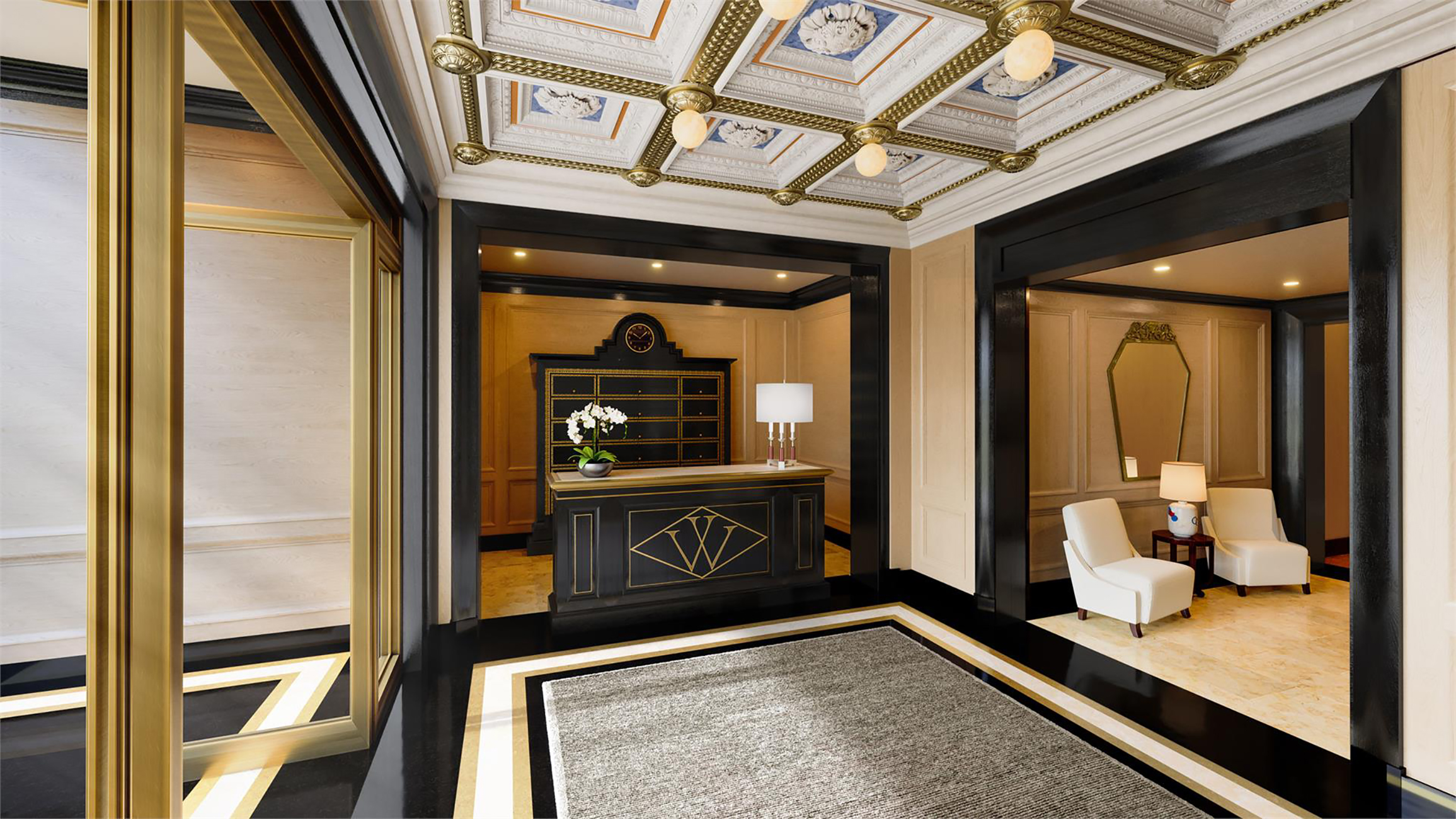
Sygrove breaks down lobby design into two categories: new development and the conversion of prewar buildings. In conversion projects, developers typically highlight the meticulously restored historic lobby as a modern-day perk. Residents of The Woolworth Tower Residences, for example, enjoy one of the most famous and lavish lobbies in all of New York.
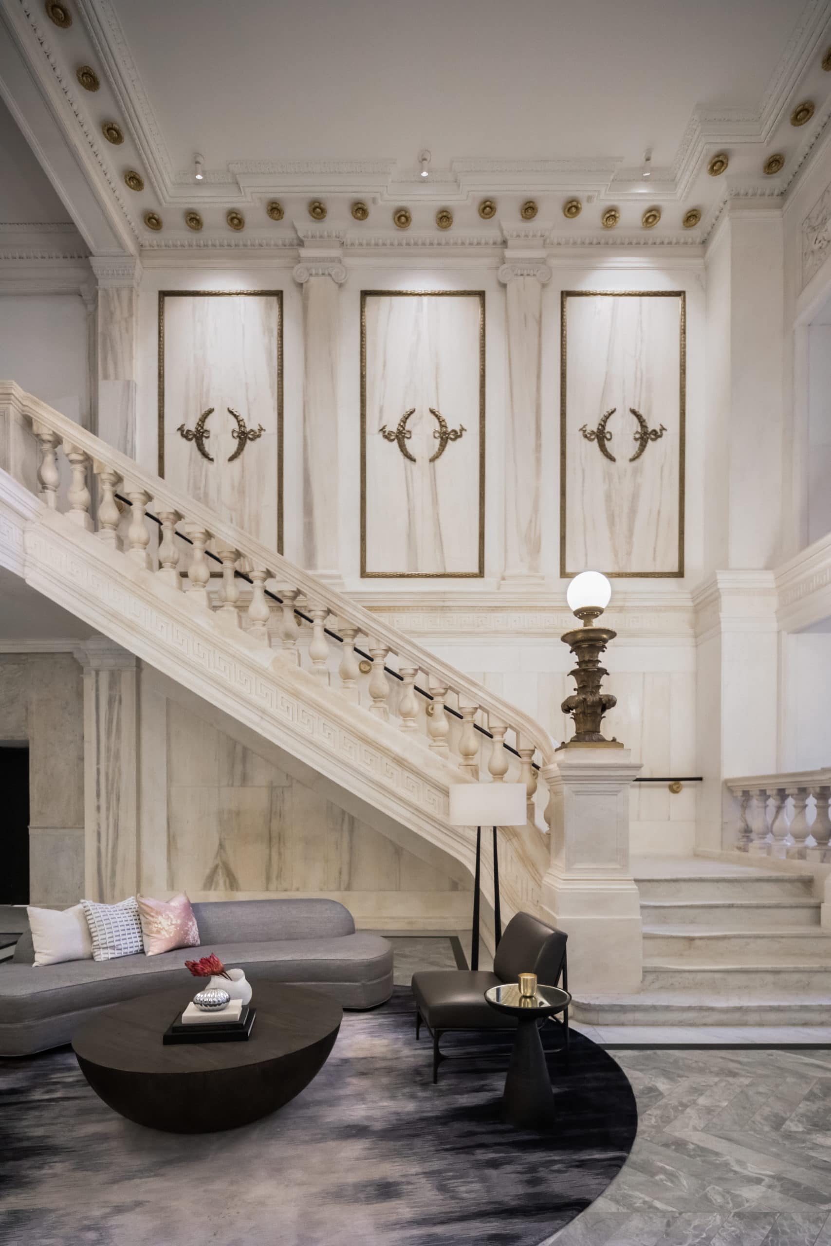 Photo Credit: Evan Joseph for 108 Leonard
In the converted neoclassical landmark 108 Leonard, residents walk into a double-height lobby with a pair of grand marble staircases, coffered ceilings supported by Corinthian columns, and ornate chandeliers. Developers C3GB and Elad Group hired designer Jeffrey Beers to add a restrained, modern counterpoint to the Gilded Age design.
For new construction, however, developers and designers have a chance to get creative. “All the rules have been broken,” Sygrove said about modern lobby design. “It’s almost like anything goes, and it’s meant to be a showstopper, memorable and unique.”
The West Chelsea condo Lantern House takes full advantage of its location off the High Line, with a 1,900-square-foot freestanding glass lobby pavilion draped under the linear park. “It features a warm palette of Eramosa marble, antique bronze, and cast glass,” Elliot March, cofounder of March and White Design, said of the design. Even the reception desk is handmade, with custom-cast glass and bronze metal finishes.
A stepped glass wall offers a seamless transition from the street to the indoors, maximizing views of the surrounding outdoor garden. “The High Line columns that pierce the space reinforce the rough texture of the once-industrial West Chelsea neighborhood, while the furnishings throughout are all custom-made,” said March. Those customized furnishings include banquettes and lounge chairs along the windows.
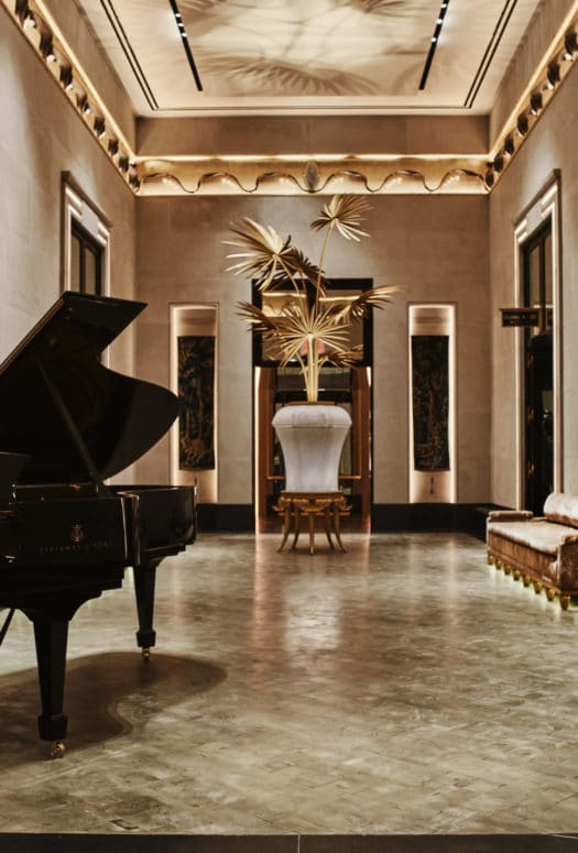
The list of impressive lobby perks is long. 277 Fifth Avenue’s lobby features a library lounge. 15 Hudson Yards showcases 25-foot-tall ceilings, a travertine wall, monumental painting, and pinhole light fixtures that illuminate the artwork and seating areas below. Inside 111 West 57th Street, opulent rooms lead to a lobby of limestone walls, cast-glass flowers backed by gold leaf, fused glass urns with decorative gold palms, and a gold and silver leaf mural depicting elephants escaping from the Central Park Zoo.
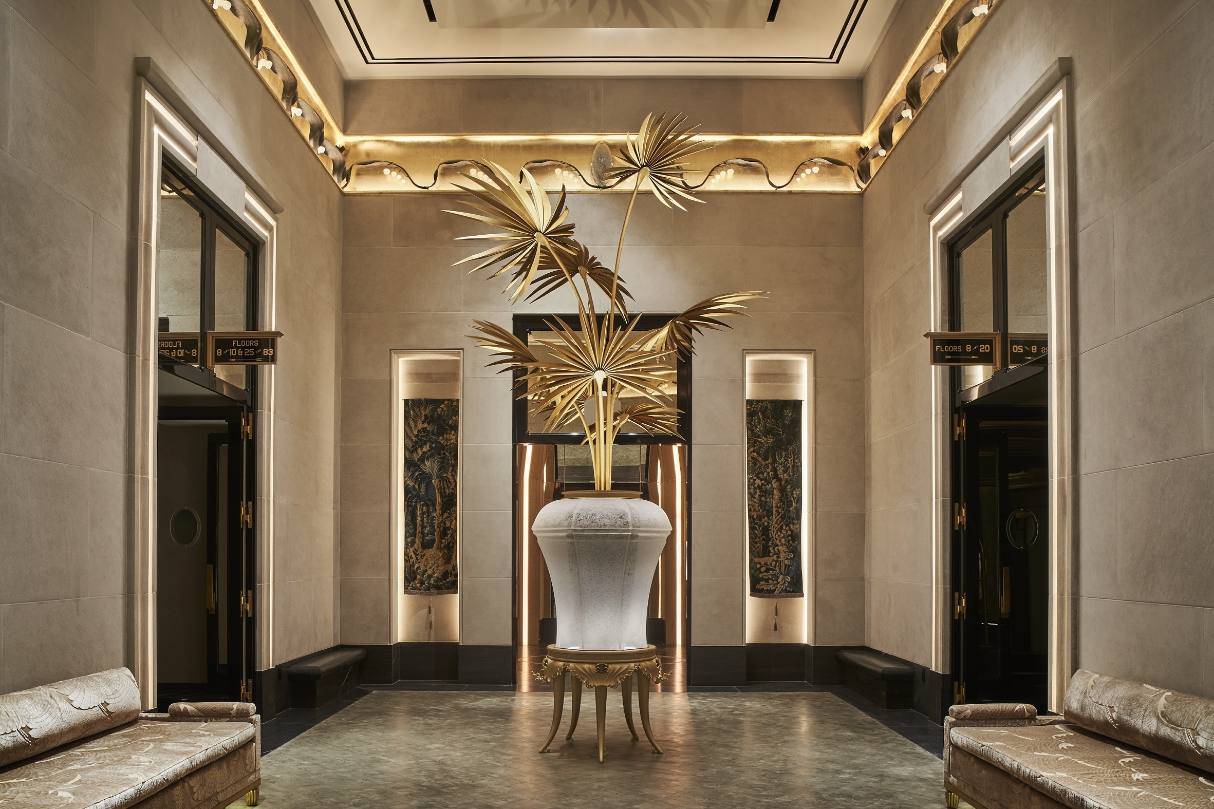 Lobby at 111 West 57th Street.
(Photo Credit: Photograph by Adrian Gaut)
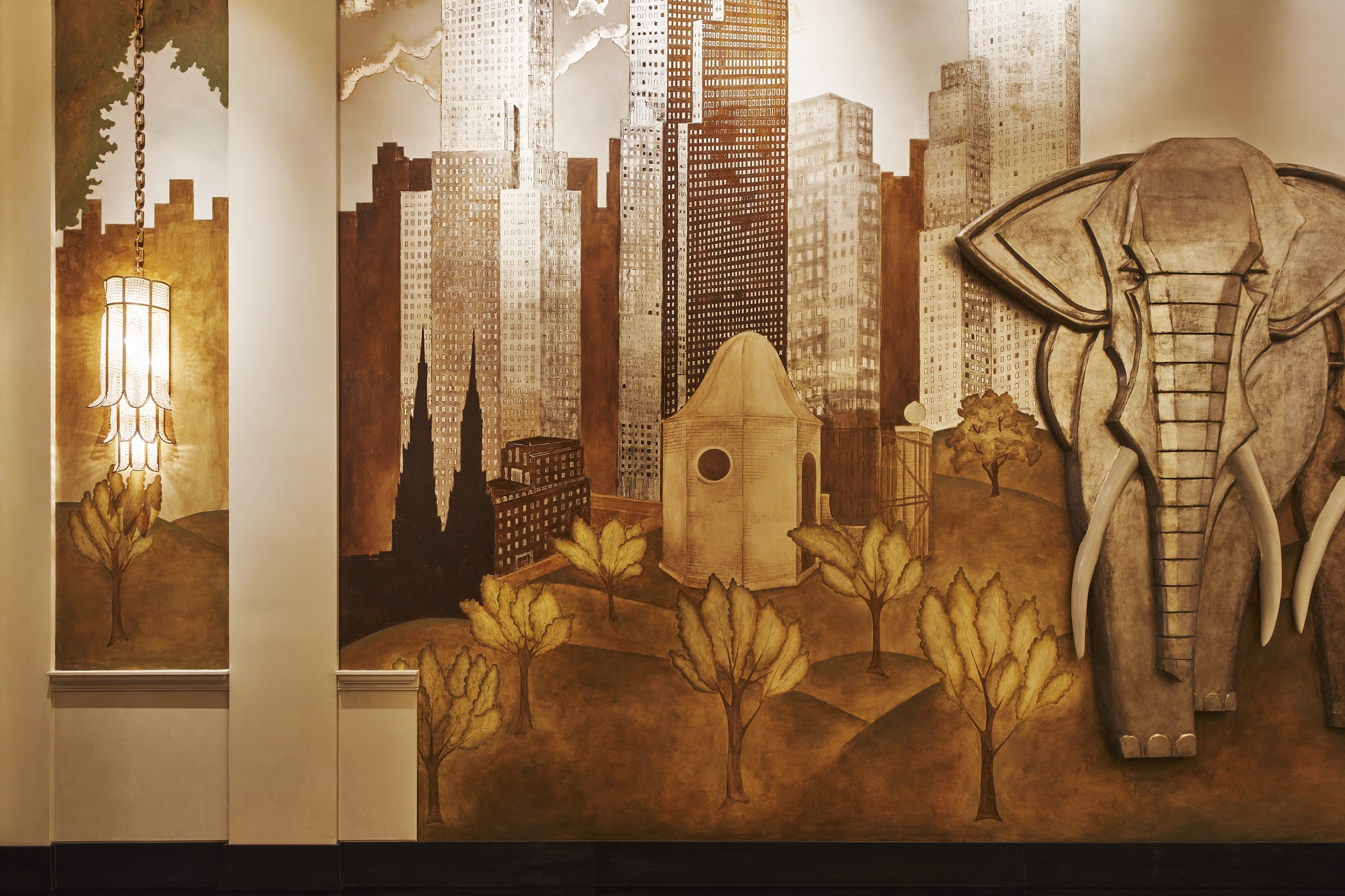 Detail of mural in the lobby at 111 West 57th Street.
(Photo Credit: Photography by Adrian Gaut)
Sygrove doesn’t expect the trend of distinctive lobbies to disappear—with the growth of working remotely, she expects to see conversions of office buildings into live/work areas, with unique common spaces to boot. “I think we’ll continue to be thinking outside the box,” she said.


